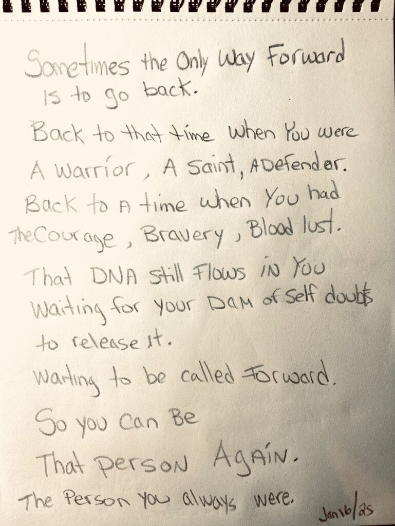
Project 1: Transformation
We had to select two of our drawings. One we liked, and one we did not like. They will both be used as influence in my new concept/composition.
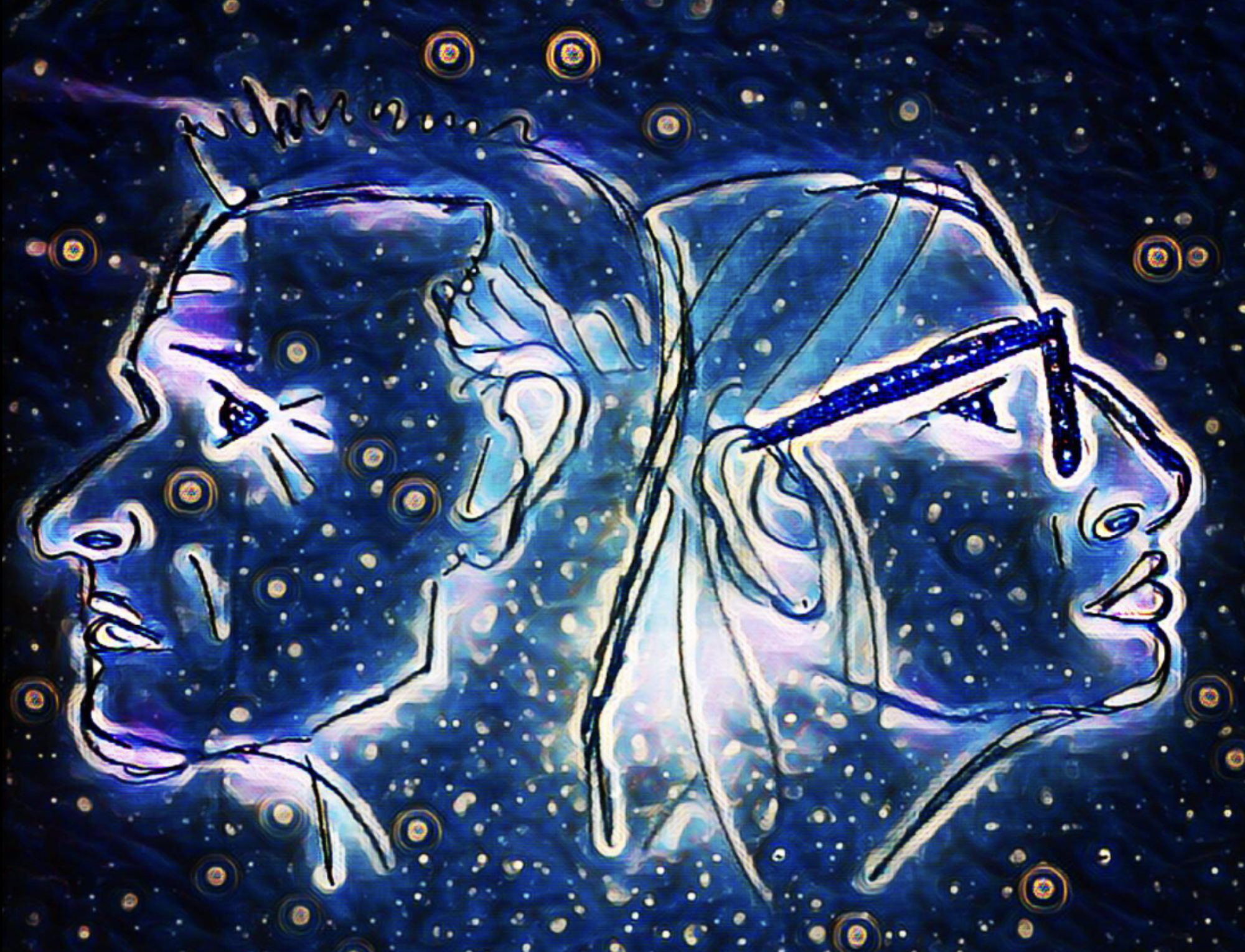
Drawing that I like:
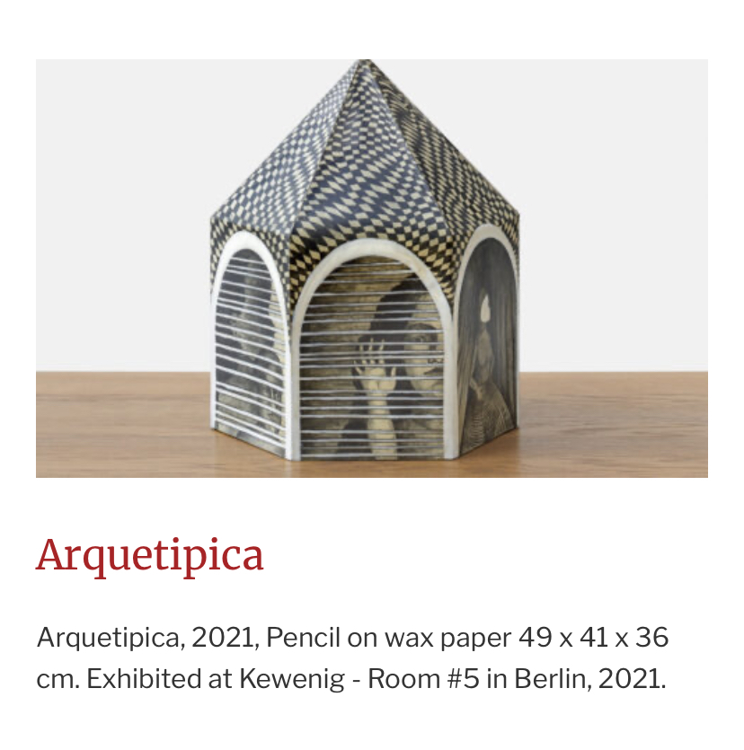
In this artwork I used a heated stylus to draw fine lines and dots. I like working in this medium as it reminds me of my Grandmother teaching me how to make pysanky eggs (Ukrainian eggs) as a child. Holding that heated stylus takes me back in time. The smell of the beeswax and the bold luminosity of the colors excites my senses. These are dreamscapes in my mind.
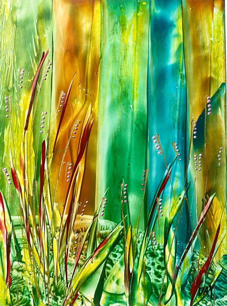
Drawing that I don’t like.
This drawing bugs me. Most everything about it is off. The proportions are all off. Sometimes when something is not working, no matter what you do to it, it still is not working. Chalk it up to experimentation and leave it at that. I also was using graphite powder which I am not a fan of.
Pieces of Me – Presentation
The very reason I am here at North Island College in the Fine Arts Program, was/is to heal in a safe place of artistic creation.
Finding myself thinking about my art, a common thread has involved Cathartic Art. When I think about ‘little karen‘, she was always making art too. It was a way for her to escape the ugliness of her then reality. A way to check out and be in a safe place for awhile. That is how I have felt here the last four years.
My Thematic Concept will be Self Identity that will be explore with some self portraiture and other personal inner dialogues that include symbols and dreamscapes.
My Thematic Series is titled: Pieces of Me and portray components of my life that require deep healing. This artwork is deeply personal to me. It goes both backwards and forwards on a linear timeline
Project One speaks to the mental illness of Religion.
Being raised in a devote catholic household I had no choice in believing or not believing.
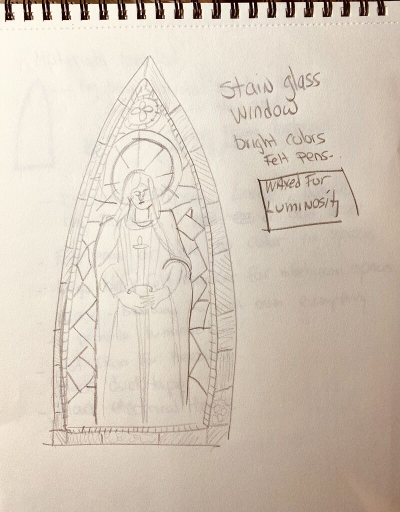
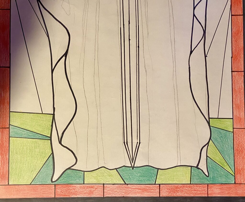
God was the almighty back then, now not so much. I have taken control of my destiny. This will be represented through a stain glass window drawing of me. I am my own God now.
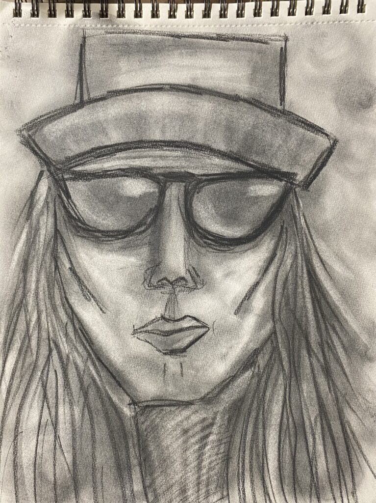
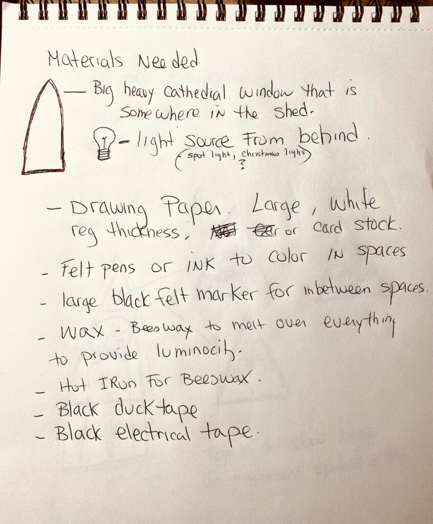
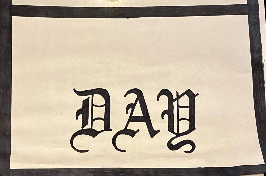
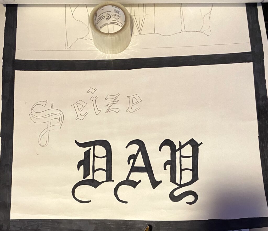
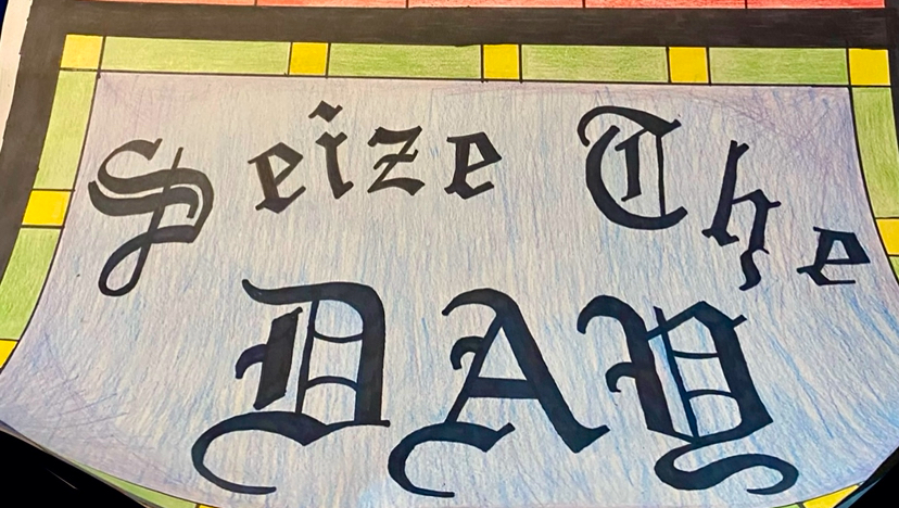
Sketchbook Idea for window
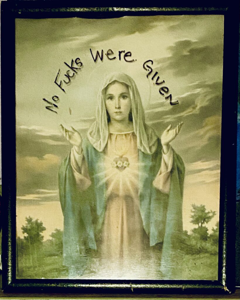
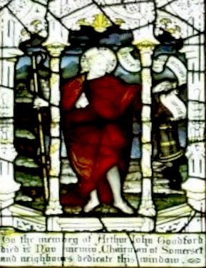
Past artwork dealing with religion.
Contemporary Artist Connection – Subject Matter.
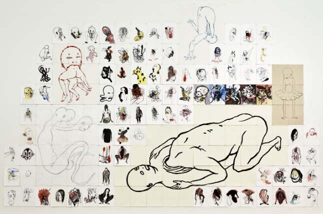
Ed Pien is a Canadian artist based out of Toronto. Drawing on Hell, 1998 – 2004 is a visual representation of his exploration of Western Hell and martyrdom. He uses the 3 minute drawing as a way to express what he feels.
Contemporary Artist Connection – Technique
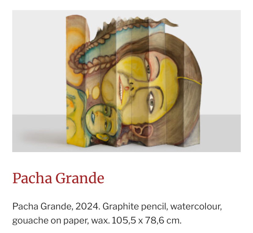
iSandra Vasques de la Horra is an artist from Chile. She is know for dipping her art into wax to give it dimension. I plan to use wax with my drawing to provide stiffness as well as luminosity to the paper.
Sketchbook Journal Pages
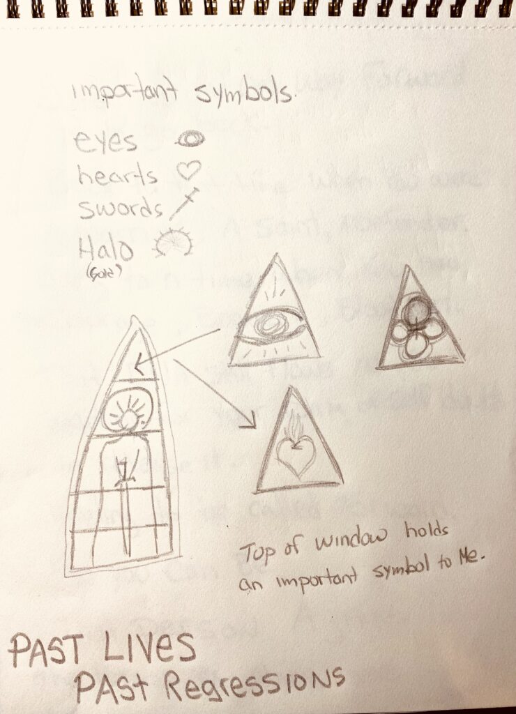
Sketch book exploration of symbols:

Thinking about the idea and some words wanted to come out of my head.
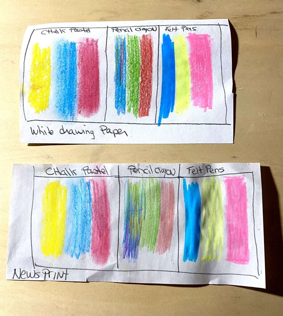
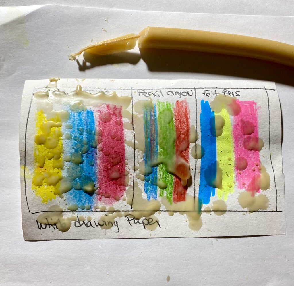
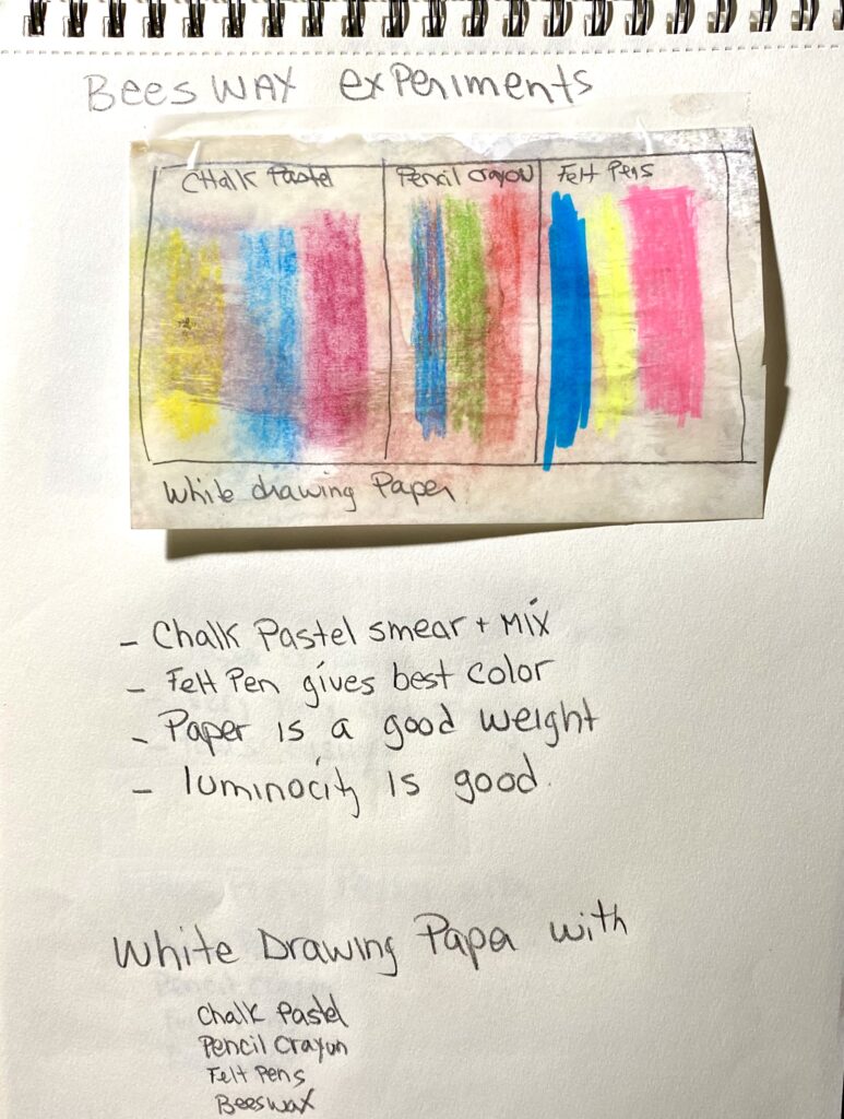
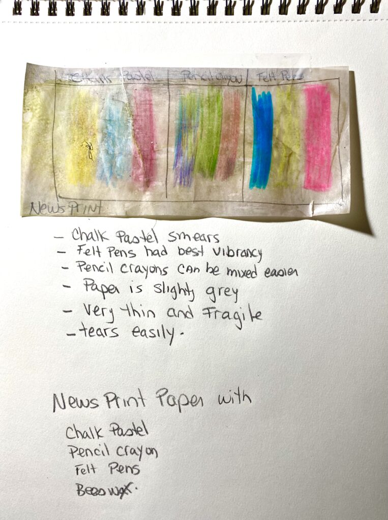
Experiments with wax, colors, and papers.
I used two types of paper from class. White paper, and newsprint. Both were colored with the same materials. Chalk Pastel, Pencil Crayons, Felt Pens.
I heated up my mini travel iron that I use when I am working with wax. A beeswax taper will be my wax source for this experiment. I love the smell of beeswax!
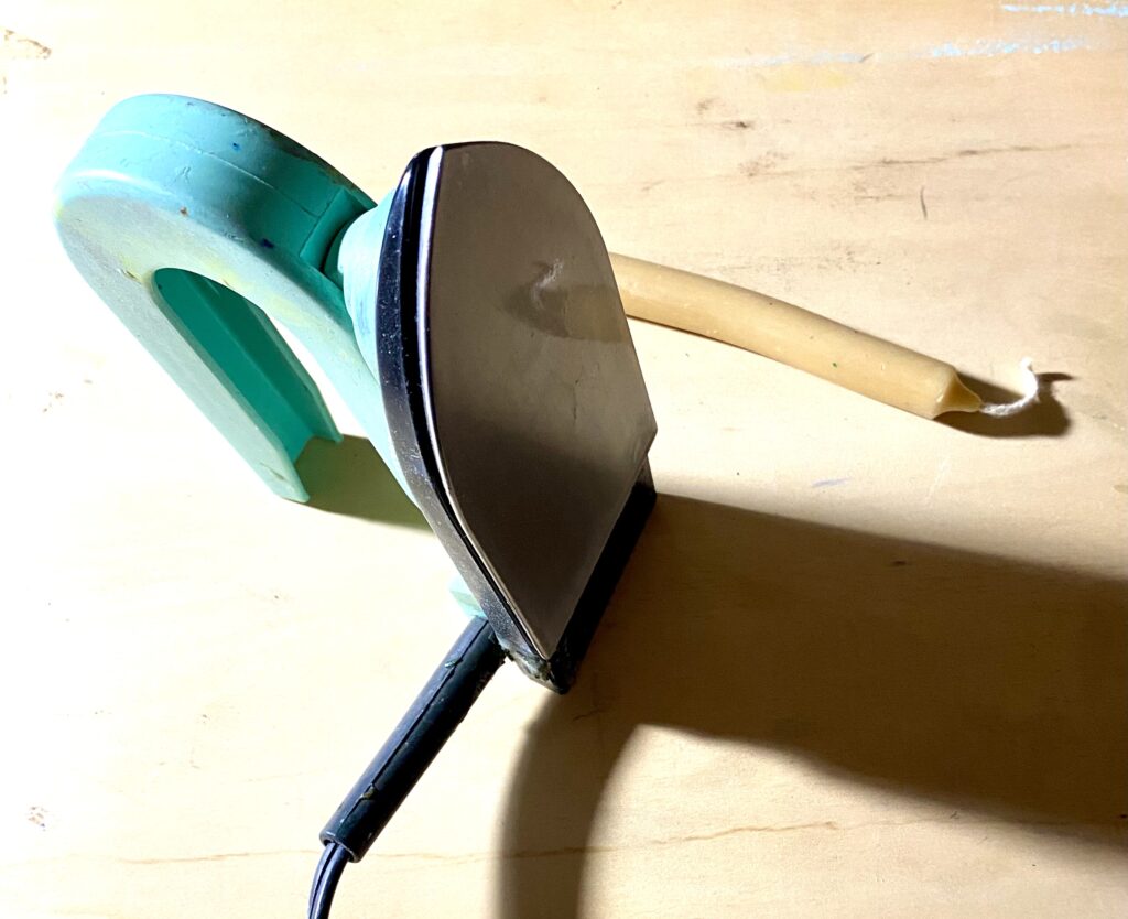
Touching the candle to the hot iron, I dripped hot wax all over the paper.
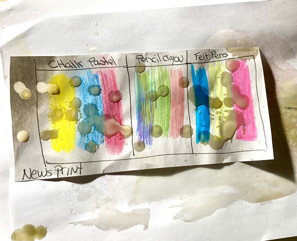
I then ironed the paper with the hot iron. This distributes the wax all over the paper.
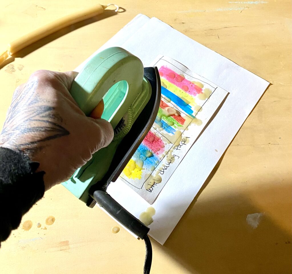
I then held the piece of waxed paper up to a light source to view the luminosity of the colors on the different papers.
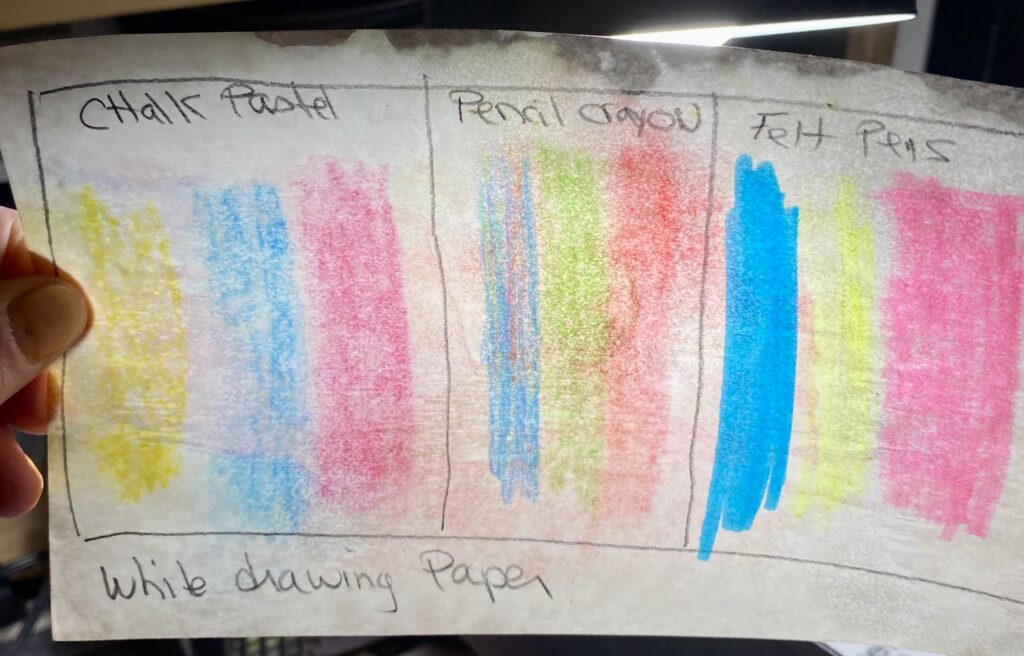
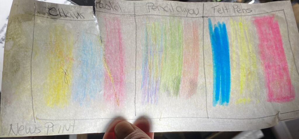
What I observed: The chalk pastel smeared with the wax. The felt pen was the brightest. The newsprint was thinner, but tore super easy trying to get it off the board after waxing. There was not much difference in color between the two papers. The white paper was a bit brighter, the newsprint was thinner and let more light through.
I believe we can also use something called gouache which I will ask about next class.
Process Journal Pages:
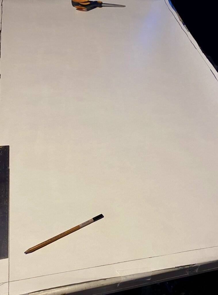
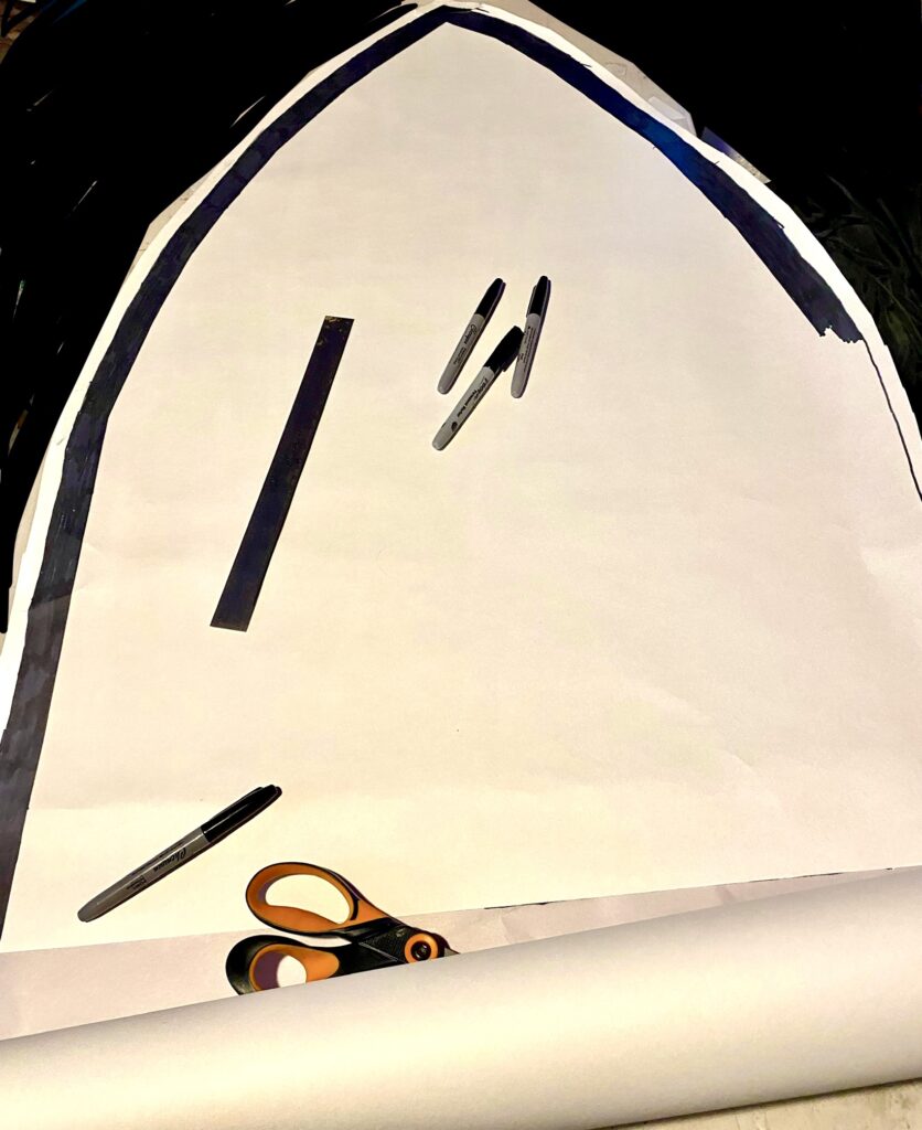
Time to get started. I taped some paper to the window for exact size. I then traced it out onto some harder paper that I bought from the instructor for $!0 (awesome deal!)
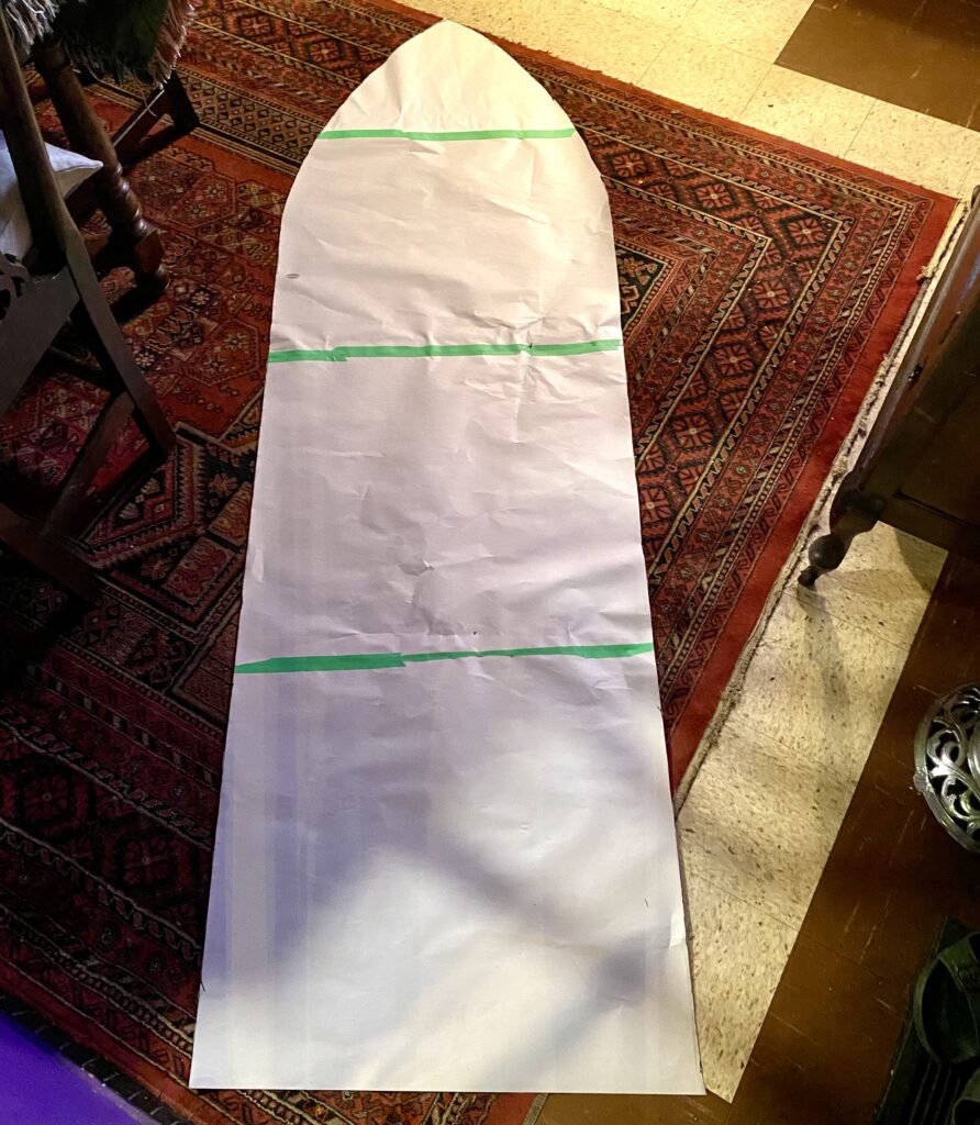
Using the width of my ruler as I guide, I traced a border all the way around top to bottom, and colored it in with black felt pen. Then the whole thing got taped to my wall.
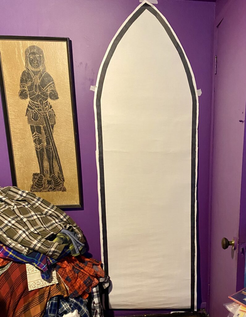
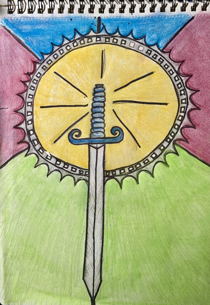
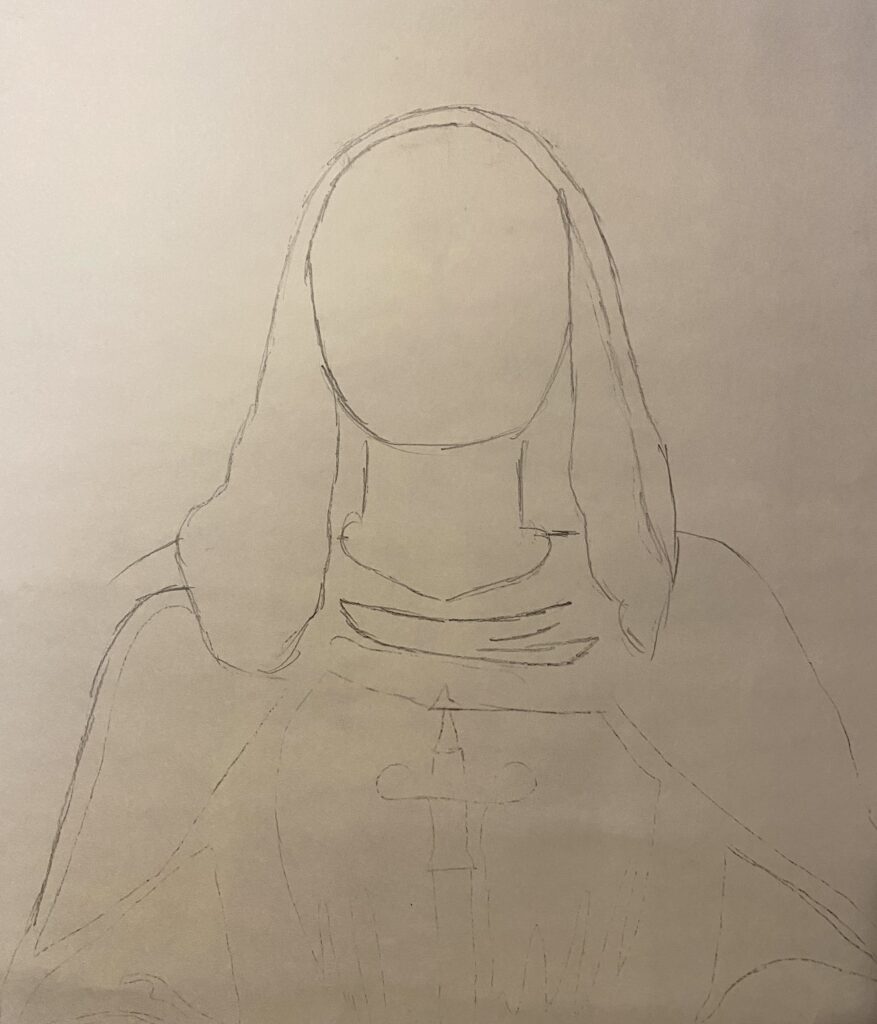
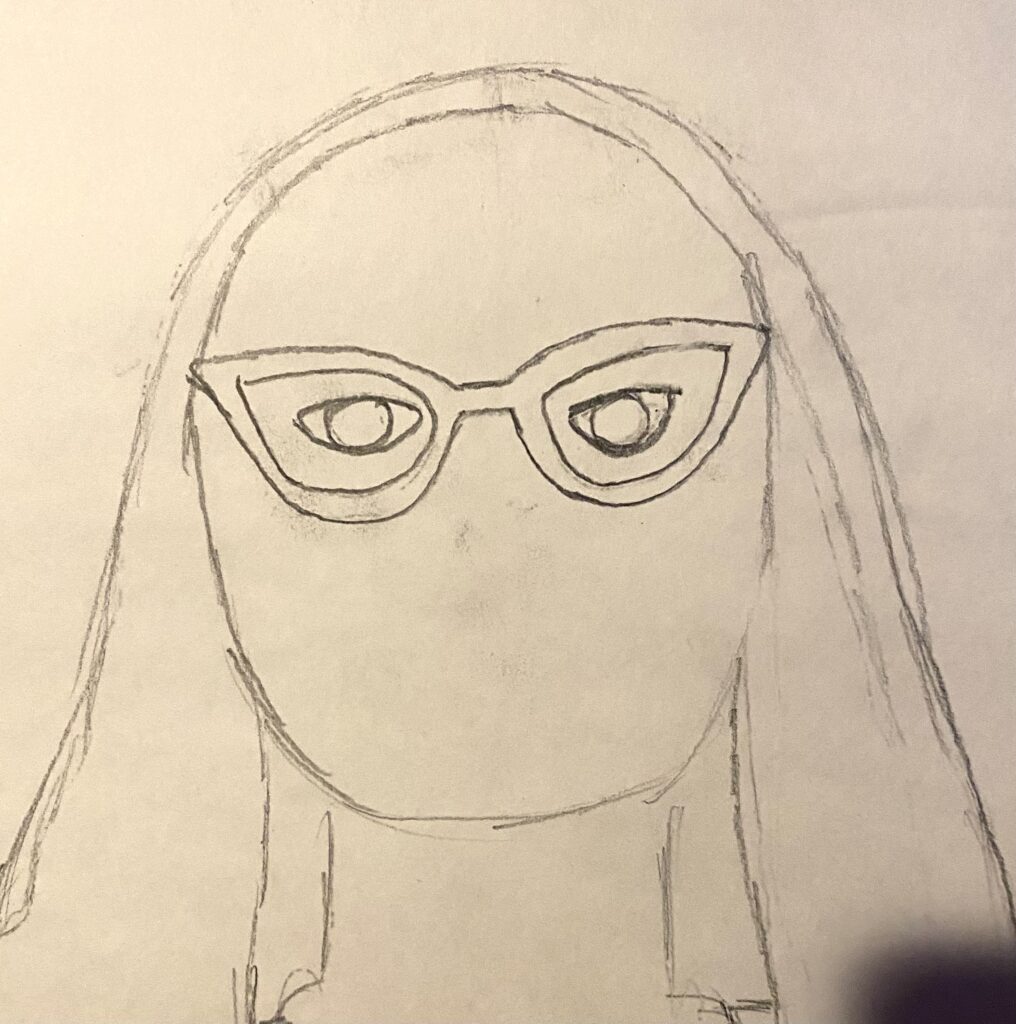
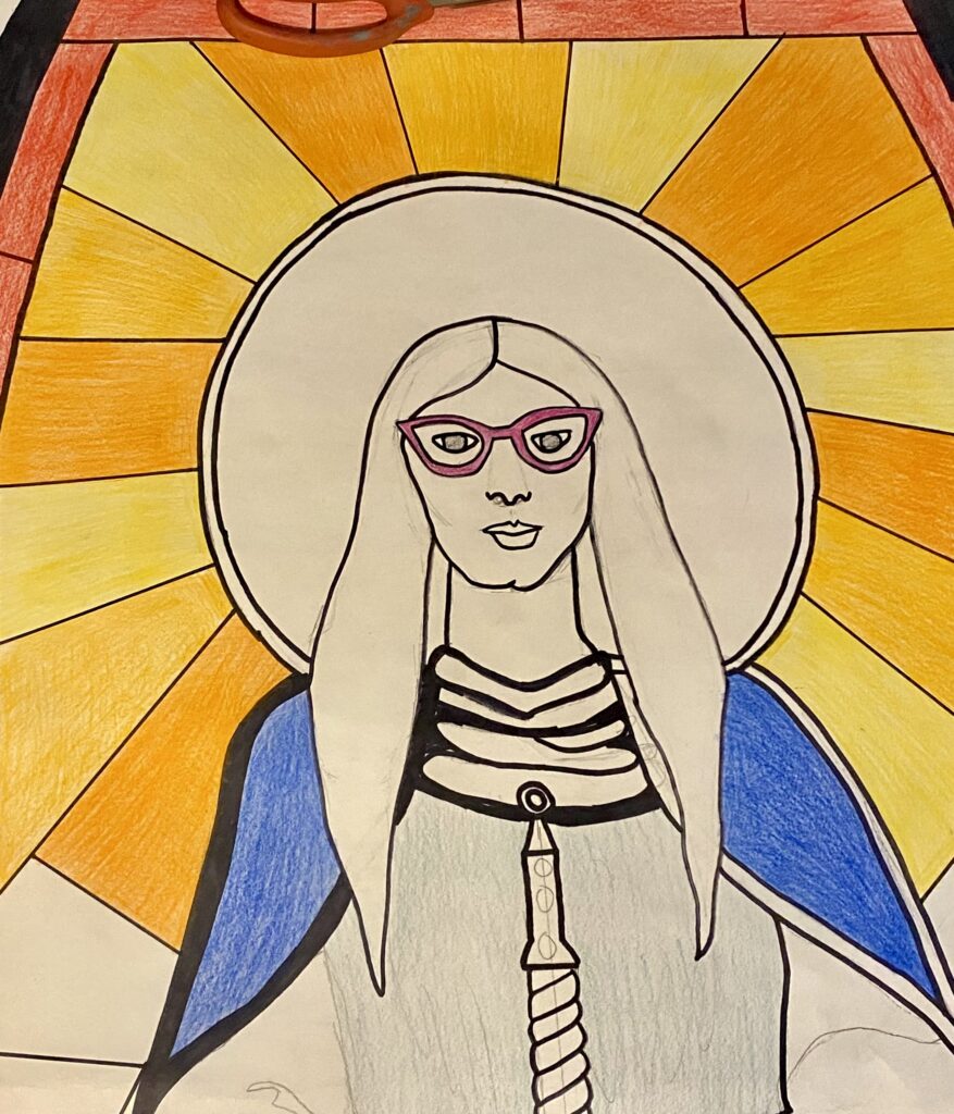
I was rather intimidated by the actual size before me. I divided it up into 4 zones and started sketching. I marked out the head and shoulders. I will worry about details later. I wanted my hands to be about midline to my body, and the sword to touch the ground. with the face, a strong feature of mine is my glasses. I drew them in first then my mouth and nose. I decided to not draw in my black hat.
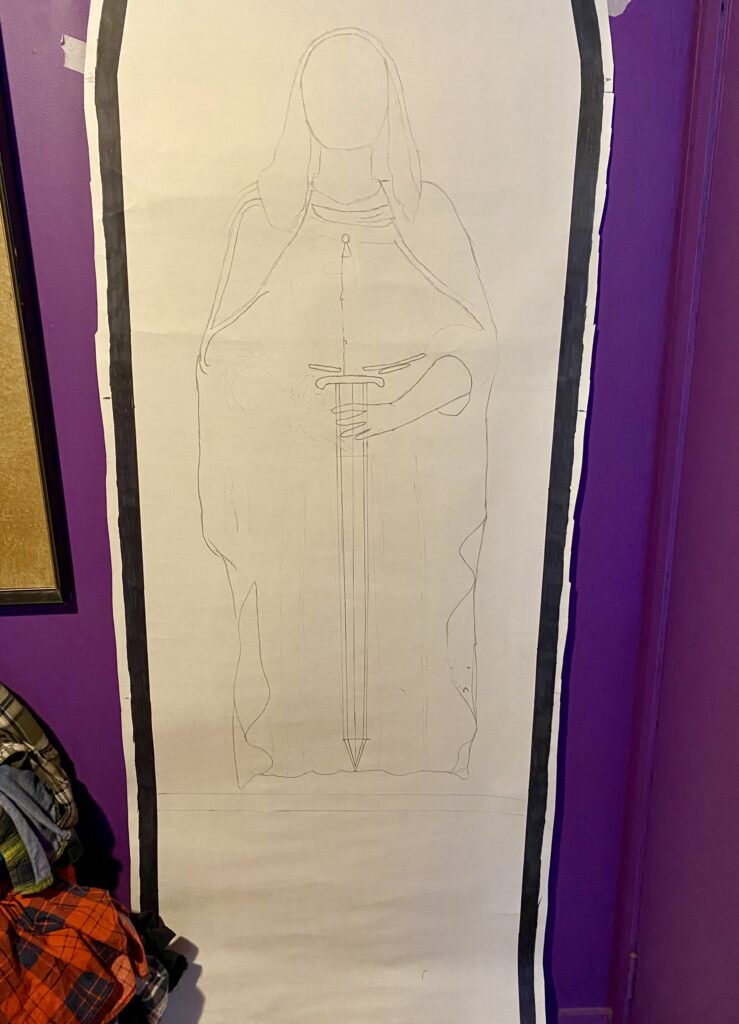
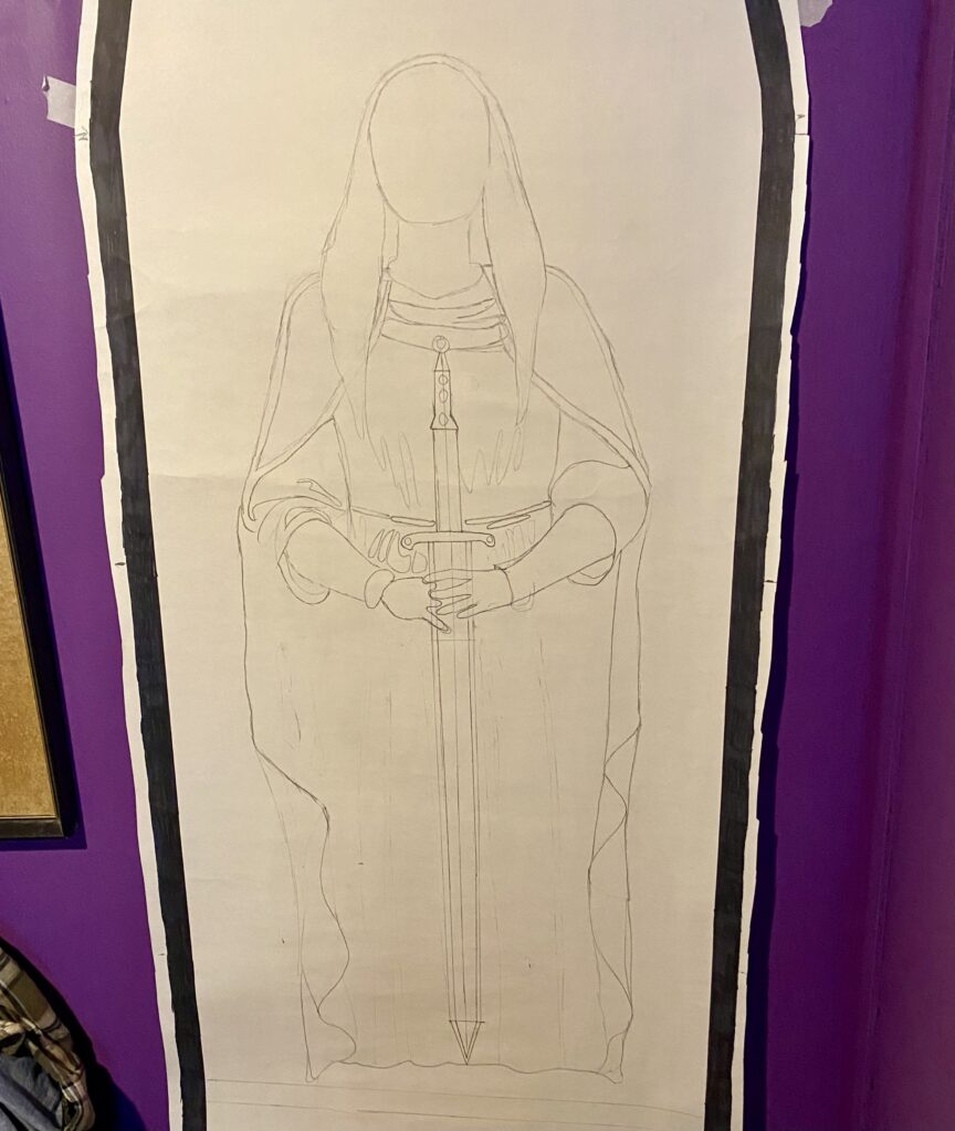
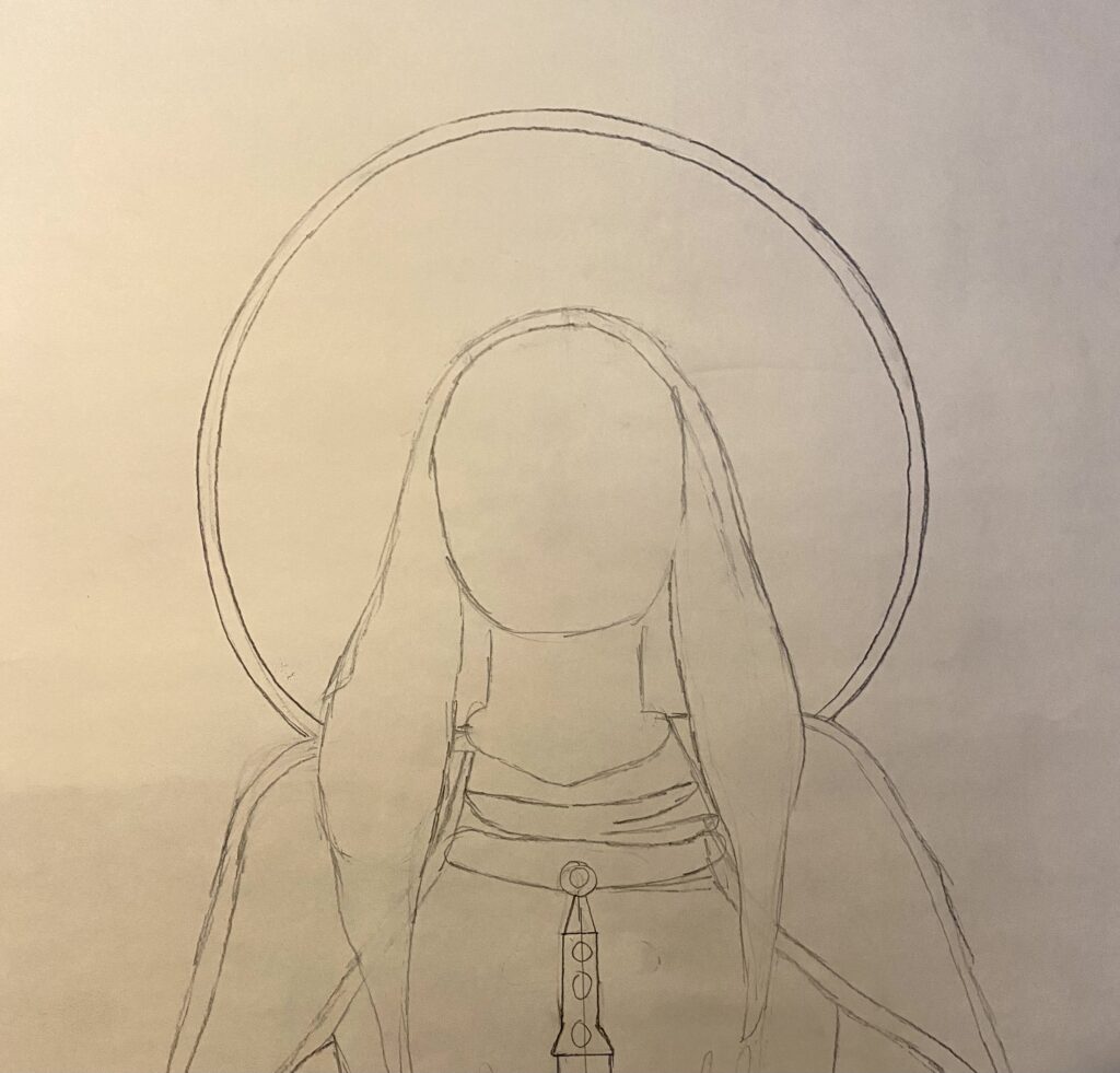
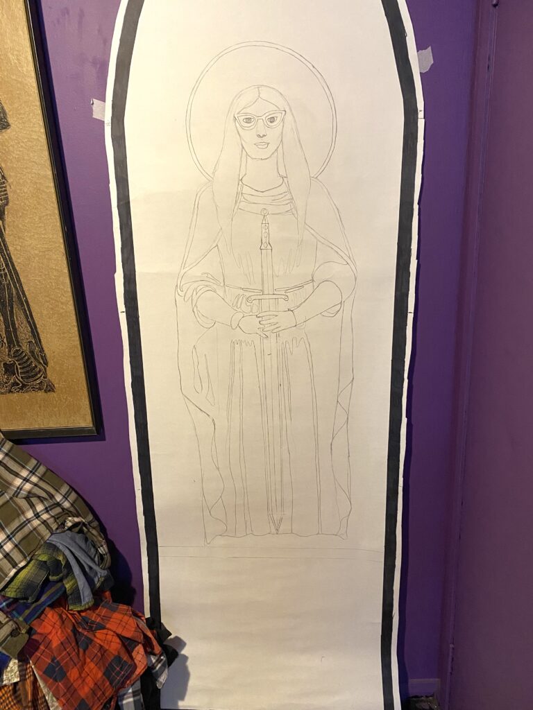
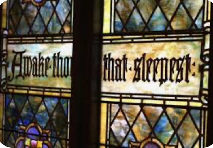
Thinking about that bottom empty space had me remembering the church text in the windows. I will add my own creed.
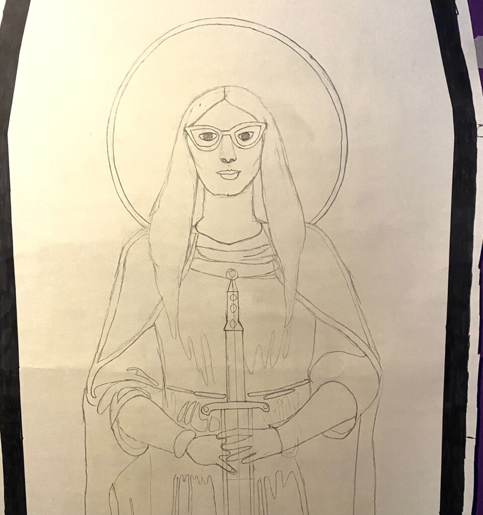
All colored in with pencil crayons.
Working up, I added some green ground area underneath the figure.
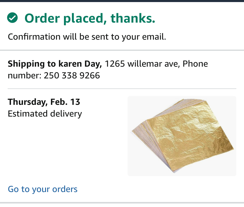
And a lovely corona radiating from my halo. While talking to the Instructor about my drawing, she mentioned the richness of gold leaf. Thinking about it, and where to get it.
Ordered some off Amazon. Says it should get here by the end of the week.
Gave myself a gold leaf afro!
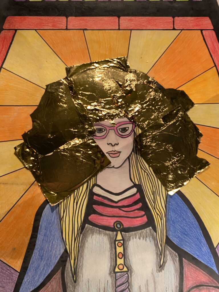
I didn’t have the right kind of glue for the gold leaf. I just used podgy and it was fine.
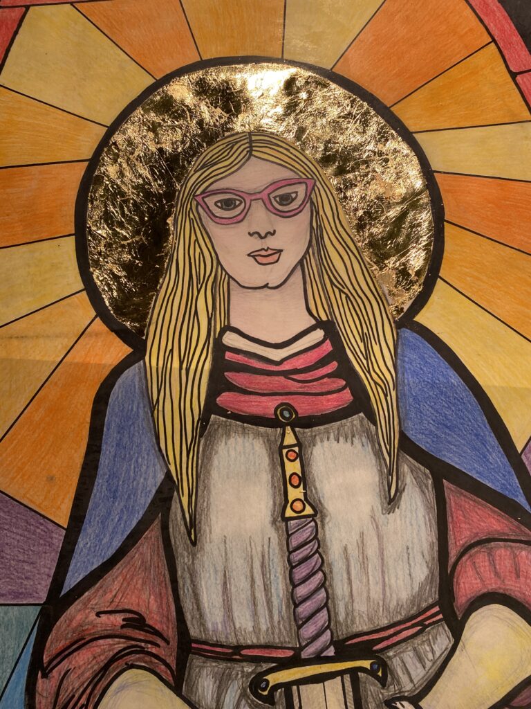
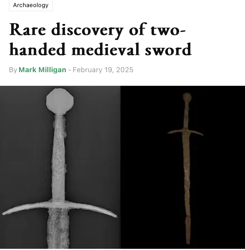
I am interested in archaeology and thought this recent article about finding a sword was interesting, and it kinda looks like the one I drew.
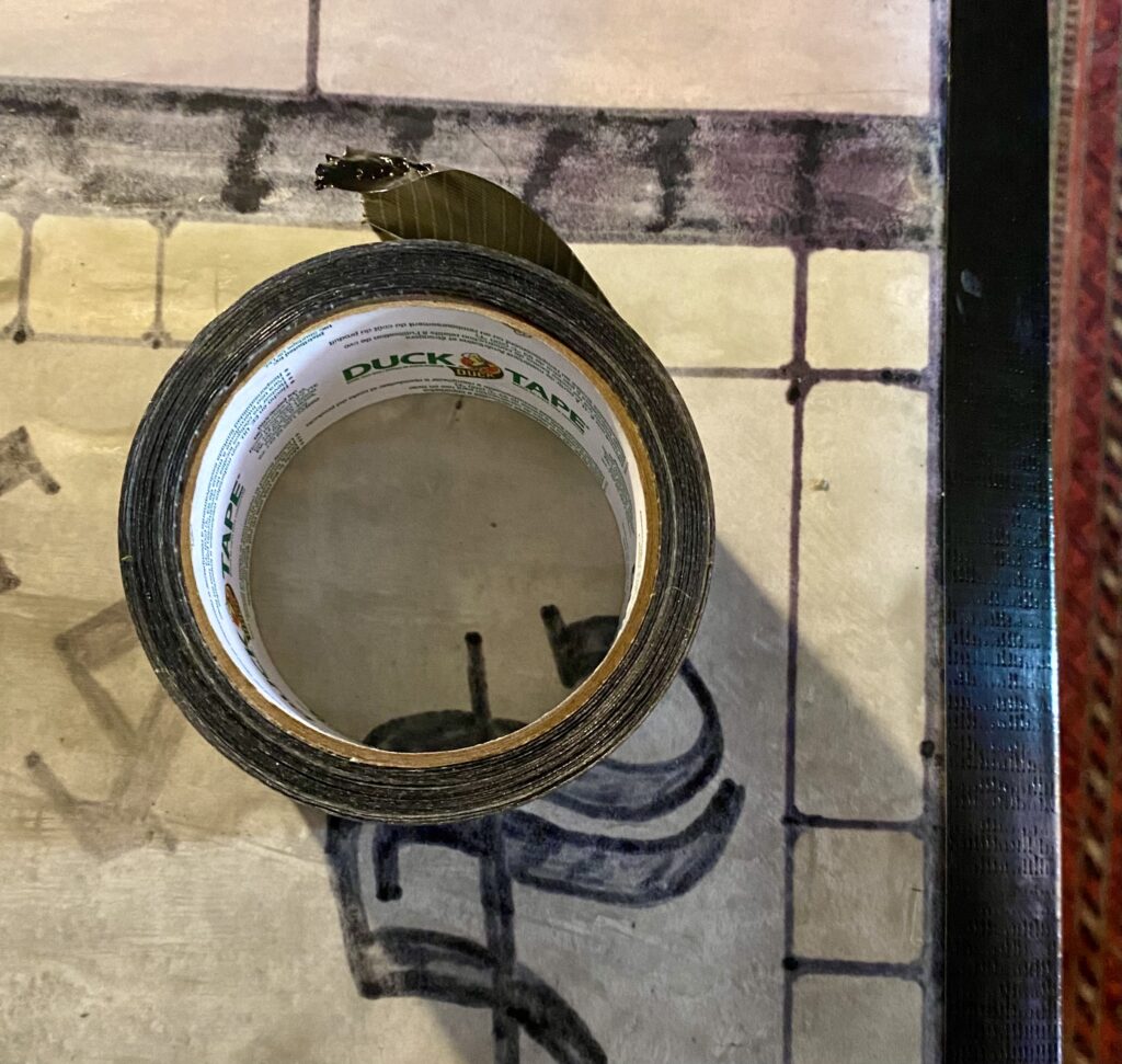
I used black duck tape to affix the drawing to the back of the glass.
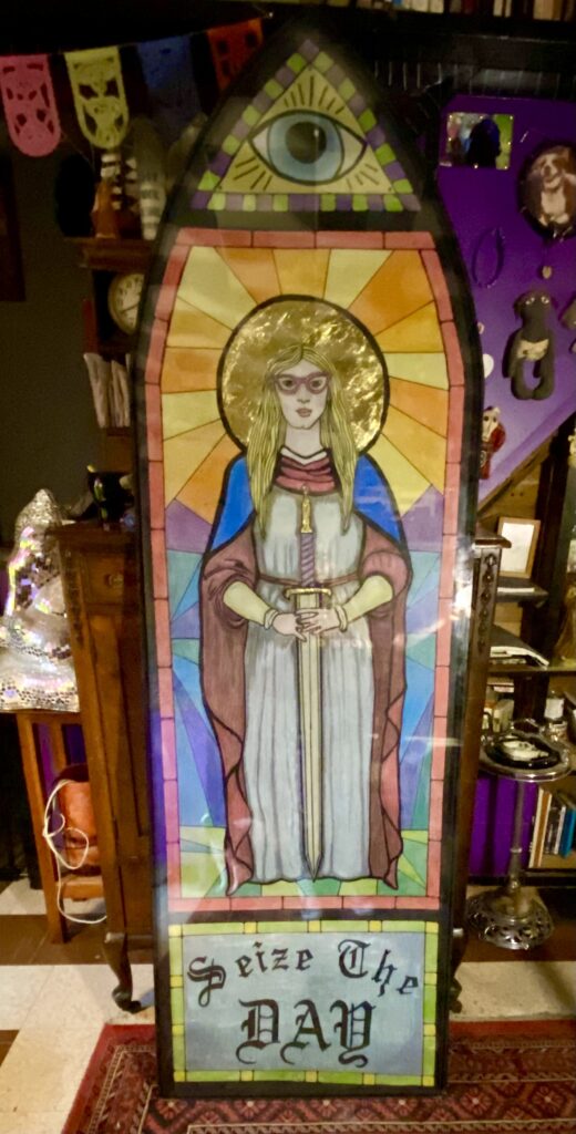
I like the way this turned out. It needs to be mounted in a frame with back lighting, but will probably just end up down in the basement somewhere.
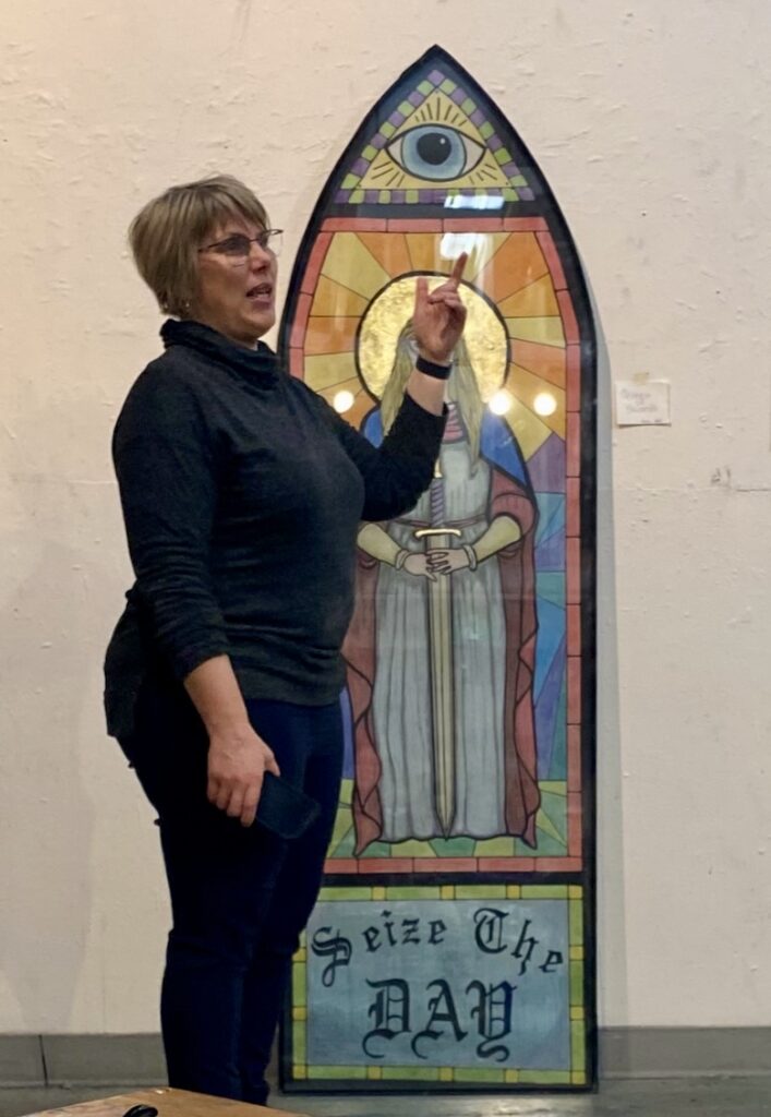
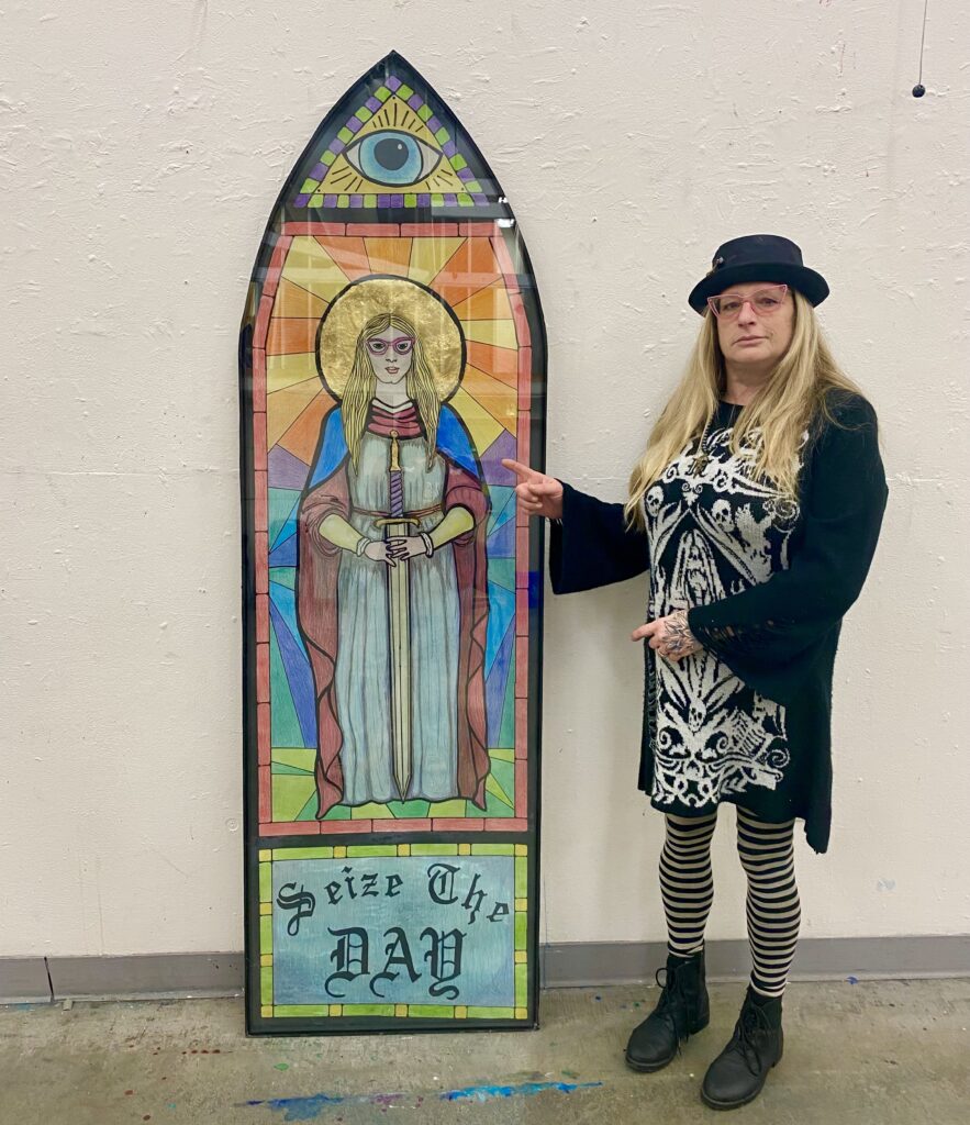
Critique day went well. I was very happy with what the Instructor and class had to say about my drawing. I feel I was able to express what I wanted to say with this piece. I take strength from my life experiences and channel the power of my ancestors.