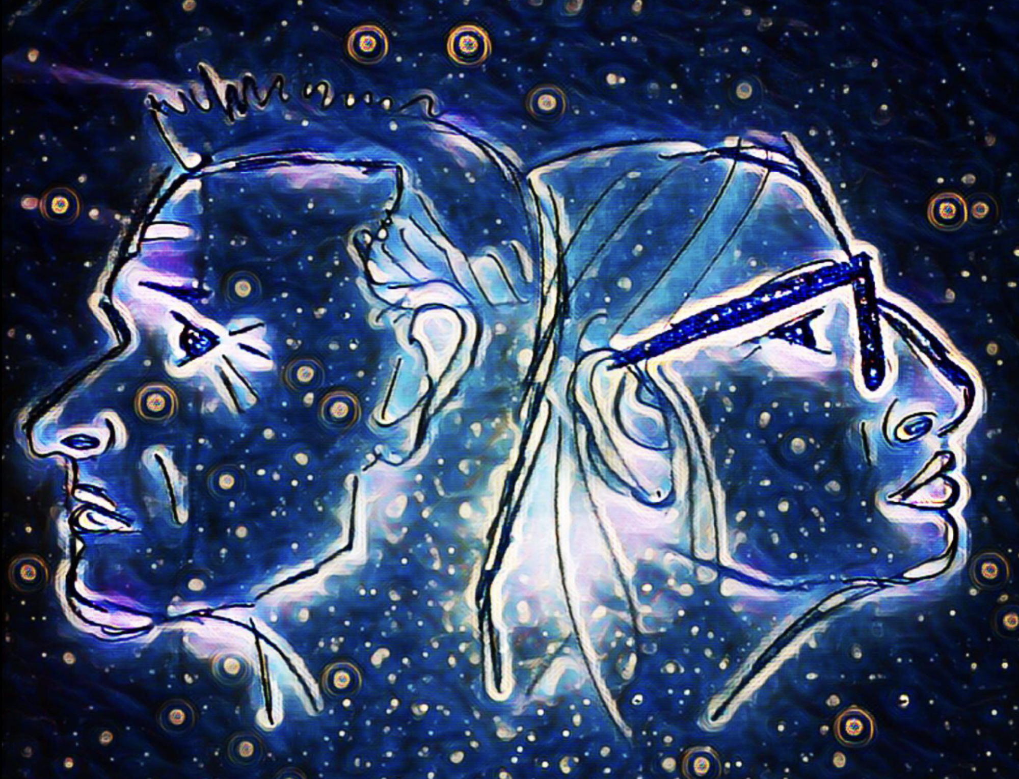
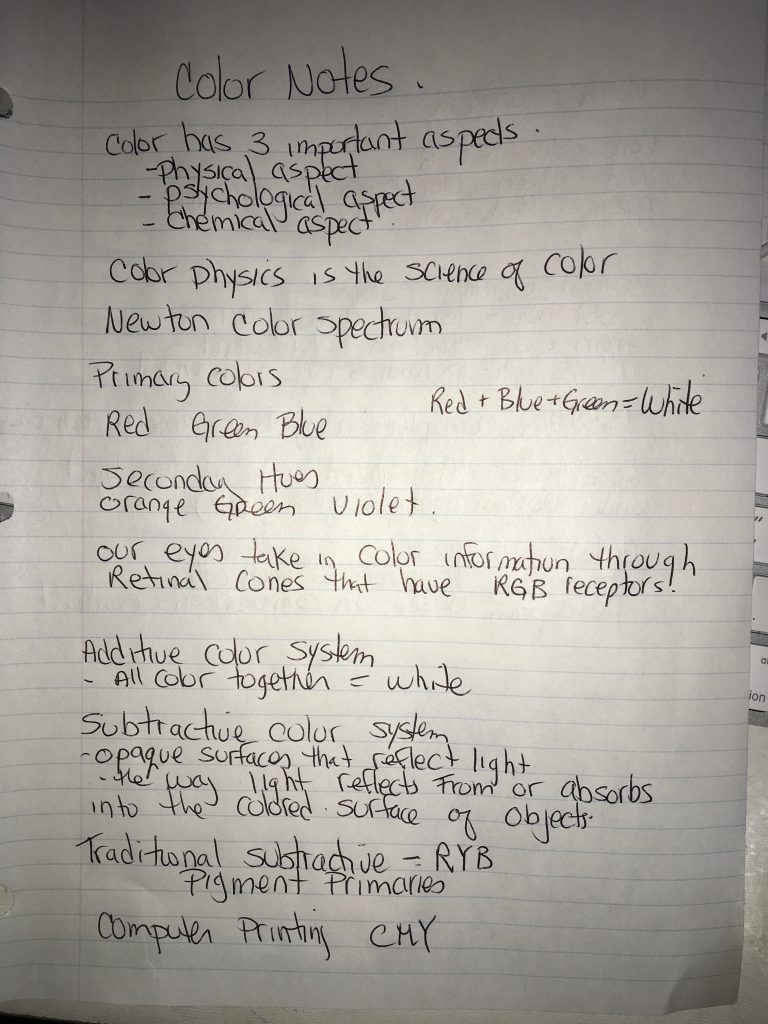
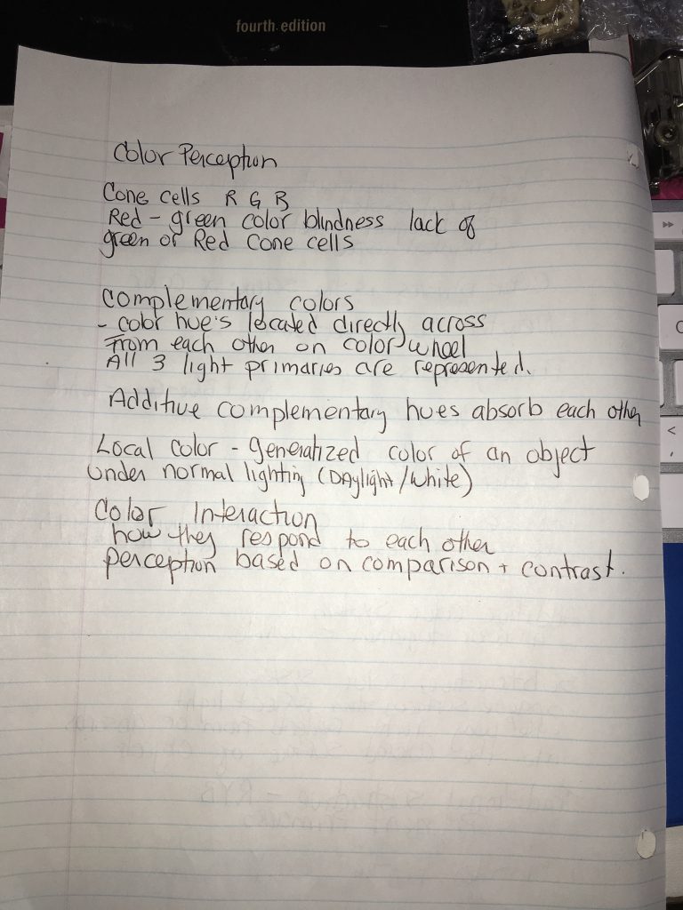
Josef Albers’s Interaction of Colors explains how colors interact with each other and can trick the eye into seeing a different color than what is being presented.
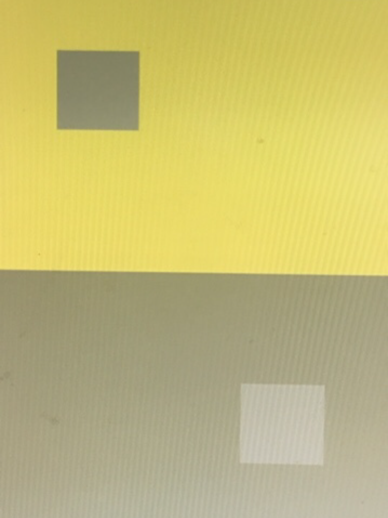
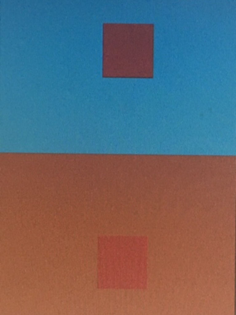
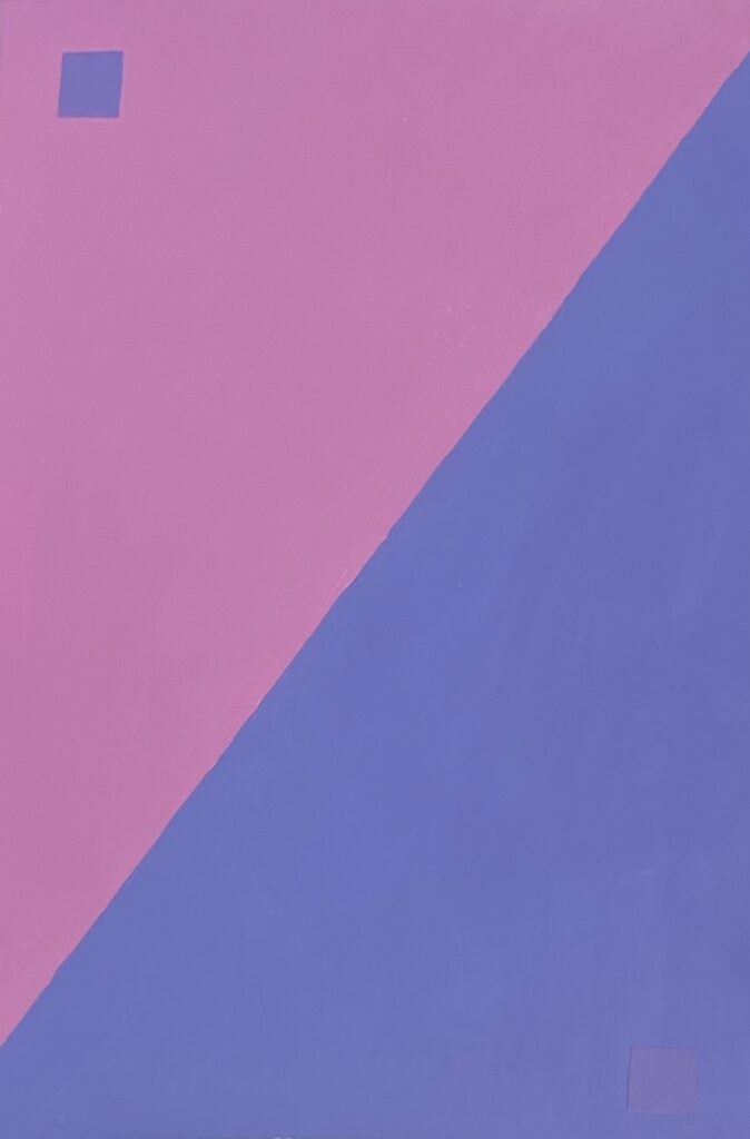
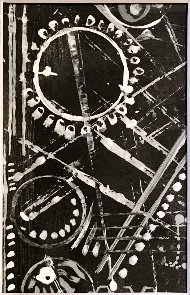
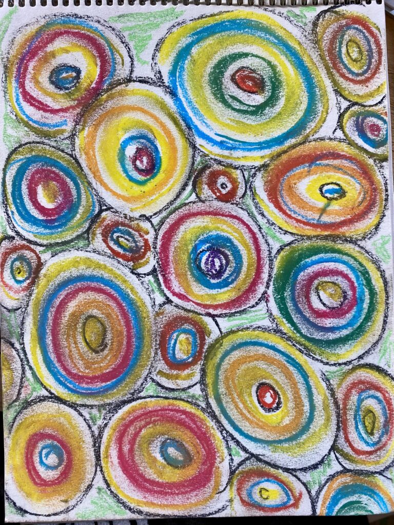
Digital Studies. when three colors become 4.
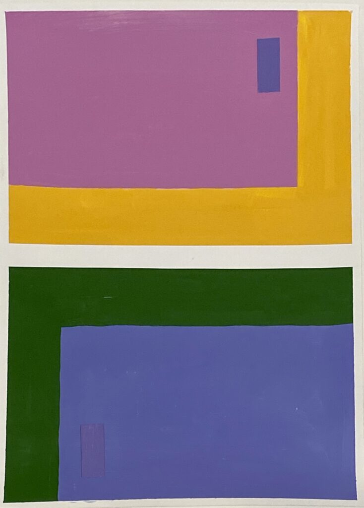
3 Digital Studies
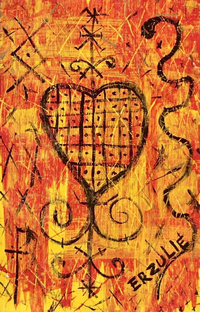
Painting of a Digital Study
I find it difficult to mix paint shades. It is about practice and mixing colors to find the right shades and hues. Who knew yellow and black make a weird green? I downloaded the App Hueduko and am training my eyes and brain with color mixes. The first half of this course (FIN 120) I did a lot of collage. My hands have a tremor and my painting can look messy. This term I will practice painting straight lines, or just accept and integrate into my ‘style’.
when 3 colors become 4
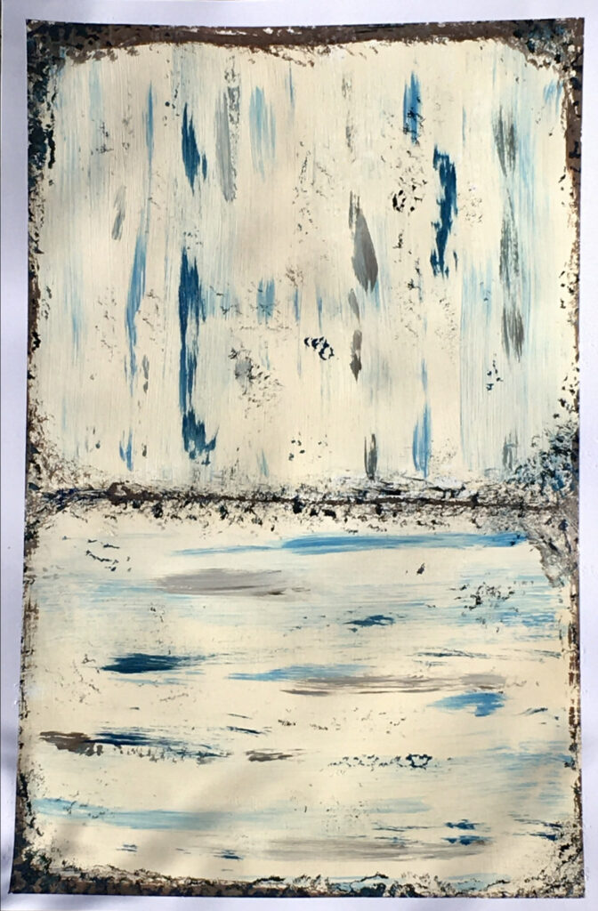
Expanded Study
Does the reading change with added colors?
Simulated Transparencies
I usually paint in wax, so the transparency is built into the media. Having to mix hue to mimic was challenging for me.
Exploring the illusion of overlapping transparenciesTransparencies and Repeated Shapes in Space.
Transparencies:Simulated and Actual
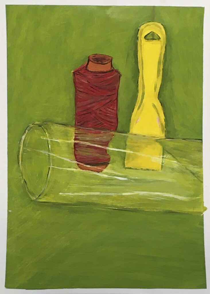
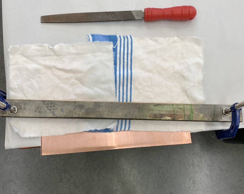
Glass Still Life
Moving into unknown territory has increased my stress levels. This is resulting in near breakdown and crying during the class. I am fortunate that the Instructor Scott and my classmates are aware and supportive of my situation. First time ever doing a grey painterly sketch on the canvas. I usually take hours to figure my drawing out and getting it painted. I will NOT let painting class defeat me! Instructor Scott was kind and supportive. I calmed down and just went for it. I am here to learn after all. Not my greatest work visually, but mentally, I won this round! I feel I did manage to capture some distortion of the objects within the glass. Looking at my composition I can see where my brain had just shut off with that concept. I was so stressed getting the painting sketch on that paper. I have to practice my mindfulness and get this stress off being in the classroom painting under control. A better composition for this painting would be to lower the still life down more towards the bottom and have more green space above the items, or, frame it in a square frame.
Working with glazes
I enjoyed working with the glazes and a grey underpainting. I was able to let go during the duration of this painting and had a lot of fun. I did find the glazes to become sticky during the process. *Note: This painting was done at home with me all alone except the dog snoring on the rug. No disruptions or stress.
Actual Transparencies with glazing
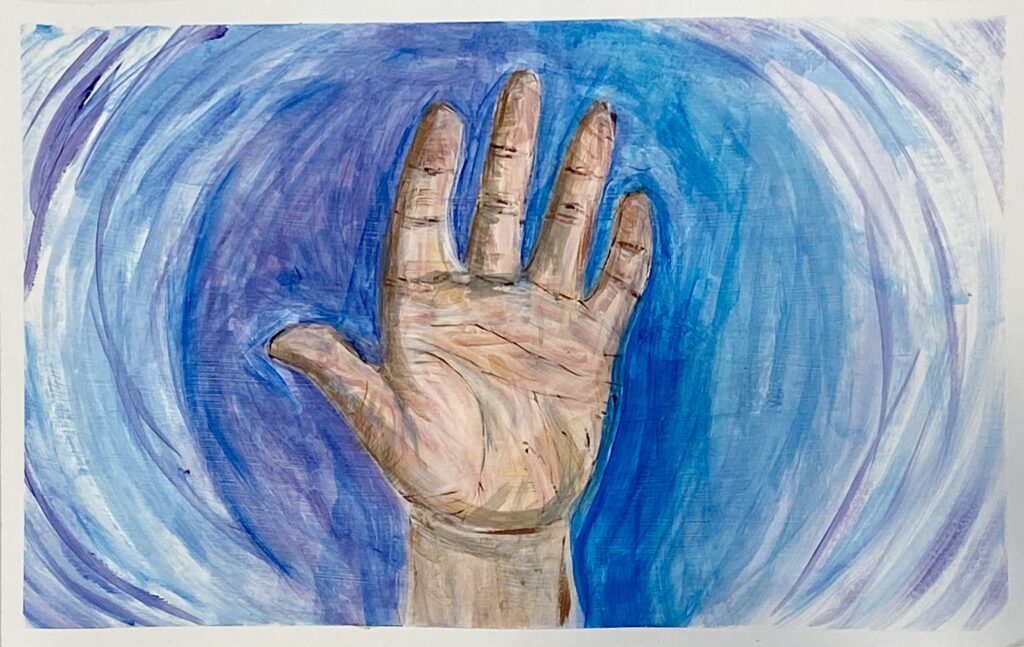
Earth Tones and Skin Studies
I have never painted skin tones in my life. With the introduction of Burnt Sienna, Burnt Umber, and Yellow Oxide to my pallet I went in for a deep dive. We had to look at our hand and paint what we see. Feeling that stress welling up, I pushed it back down and just decided I would mix the new earth tones and paint squares on a piece of paper. I spent about an hour just trying out combinations of colors. Then I jumped in and quickly sketched out my hand shape in gray paint. I learned that shadows can make things way more interesting and provides tone and color shifts. I found it absorbing to look so deep into my skin. Skin tones are many layers and overlaps. End of class I was considering throwing it away and starting over at home. Instructor Scott encouraged me to continue on with it and not give up. I started in with the blues and the reds and some purple. Looking at the finished painting my mind just wants to discount it because my hand proportions are off. Pushing past that, I like what I painted and was excited to start my next study. My daughter is a powerlifter and I took a picture of her knee. Talk about strange proportions! I had fun painting in the tones. The shadows on the right provided me a challenge. After I was done, I painted in the green background. It made my painting pop.
Painting of Hand
Moving from the Abyss…
Painting of a Knee
Powerlifter’s Knee
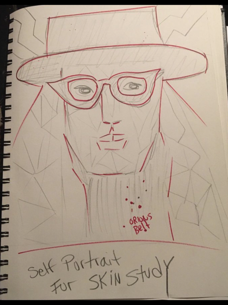
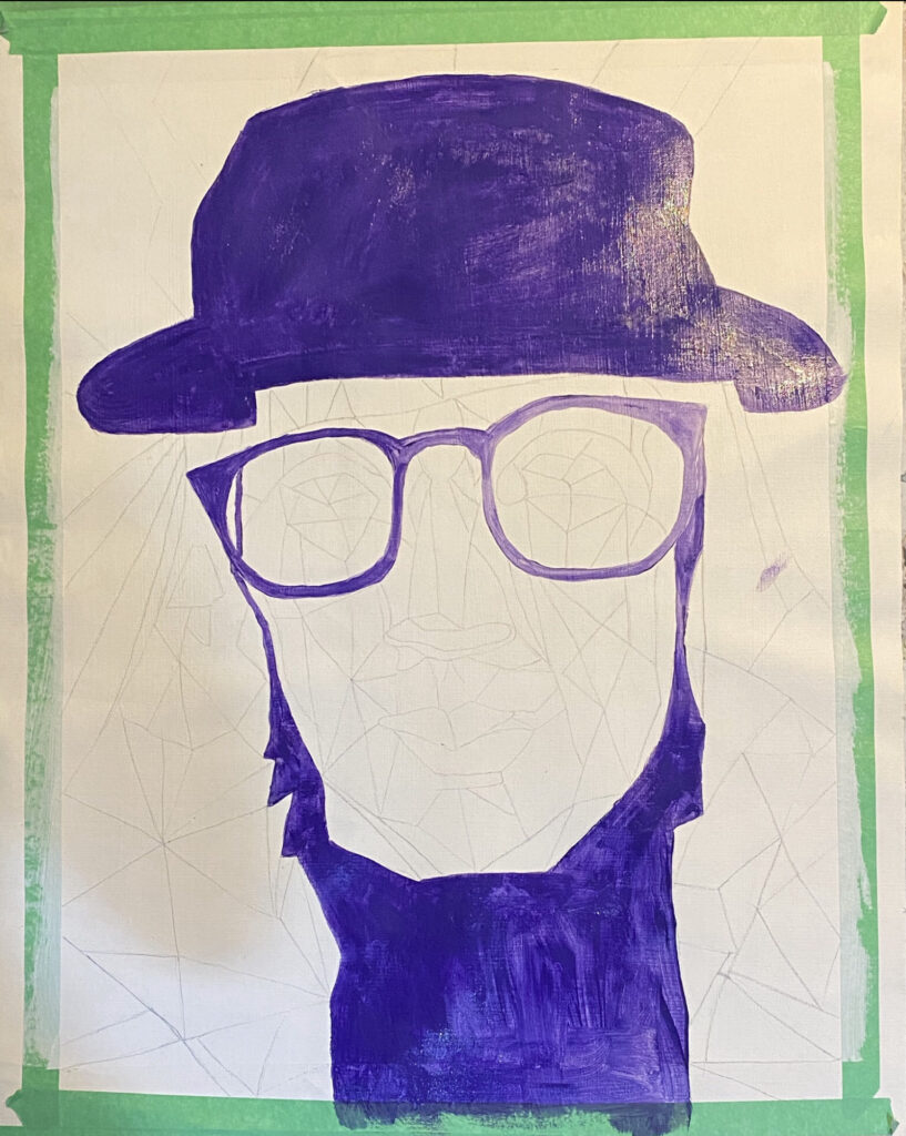
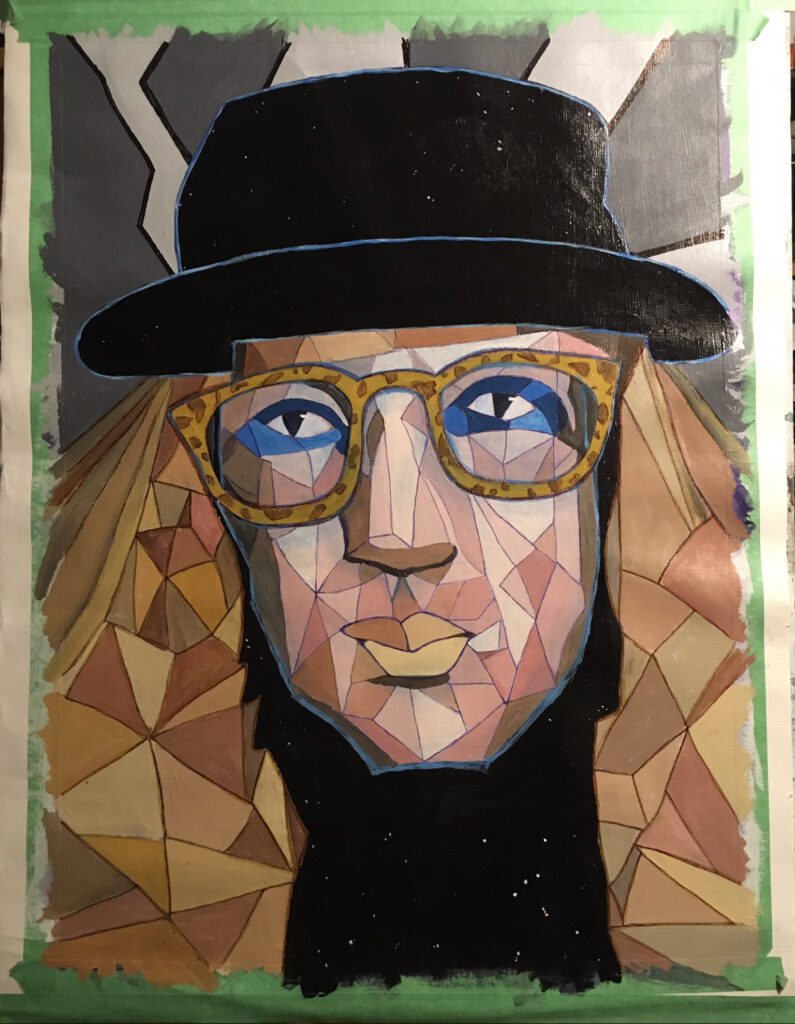
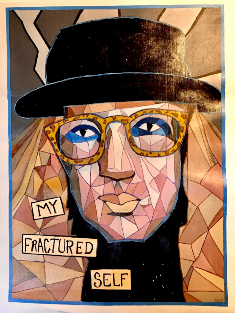
Self Portrait
I am ready to attempt my self portrait. I did a sketch and had an idea about fractal planes. I asked Instructor Scott if it was okay to do something of that nature. He said yes, and gave me some tips about finding the shadows and filling in color blocks on my underpainting. I used a grid system and drew in my outlines with pencil. I just wasn’t confident enough to do the painterly outline sketch.
I chose to use purple as my underpainting. I felt very hesitant to start, so I did the dark purple tone first. Then I kept adding white to lighten up the paint. I liked how it looked all in monochromatic purple hues.
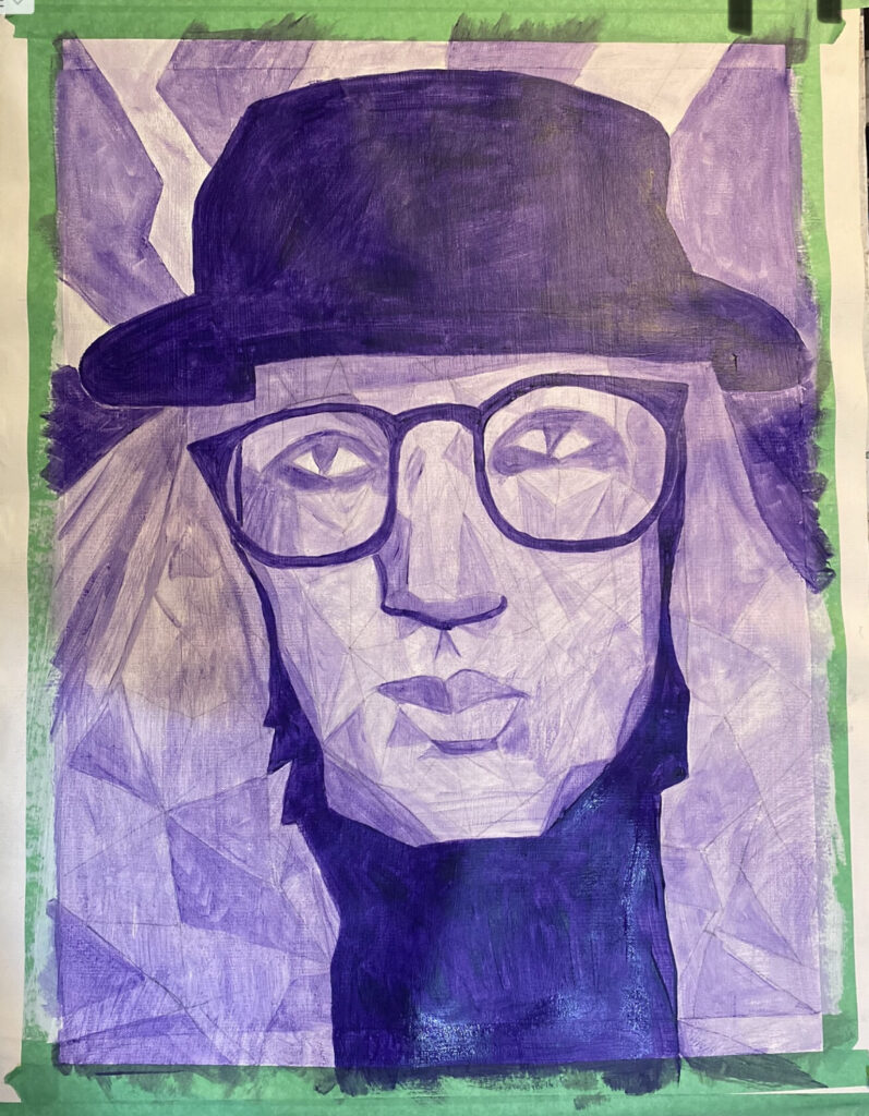
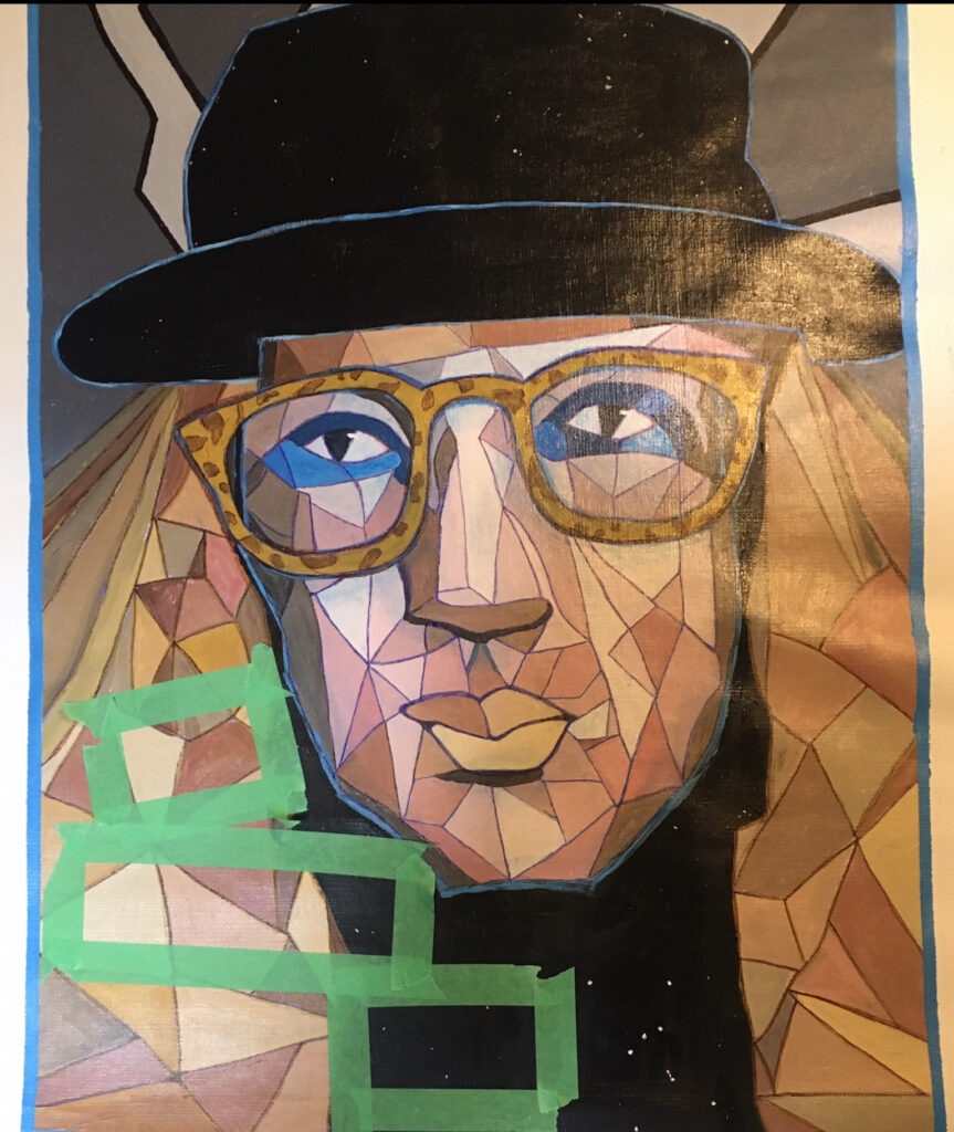
Now to start the overpainting. It does feel like I am painting this twice. I see the benefits as you can just paint over areas you do not like. I thought it best to start with the light colors first. Using a mix of white and Burnt Sienna I added in the light highlight spots first. I mixed up a fair amount of this lighter color. I used it as a base for adding my other mixtures to it. Yellow Oxide and Burnt Umber were introduced as well as black and white. I started filling in the face planes with color. I used more red in my face and Yellow in my hair. I tried to keep the purple underpainting peaking out in areas. For the dark areas of my hat and chest I used black mixed with blue. The constellation Orion is represented over my chest. Things are starting to take shape. Then…I painted blue eyeliner around my eyes. Yikes! Flashback to grade 7 attempts at makeup with liquid blue eyeshadow. My eyes are over dominating everything. I will have to tone them down or do something…
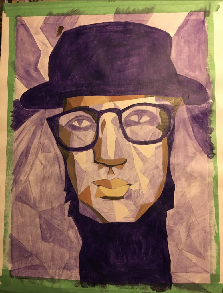
I lightened the paint a bit around my eyes. I had to add something else to tie that blue in. I outlined my hat and face in a lighter blue, and brought in blue streaks around my glasses. Using the glazing medium, I also tinted that blue and painted that around the shadow areas of my face and behind my glasses. It is looking better but still needs more blue. Using green tape, I created a small border around my painting. This was painted blue. It help frame and ground everything within the painting. Something was still missing. Too much dark empty space under my face. Out came the green tape and some little boxes were made.
I painted them a tan color similar to my lips. Script was added into the boxes. Now I feel my painting is done and ready for tomorrow mornings critique.
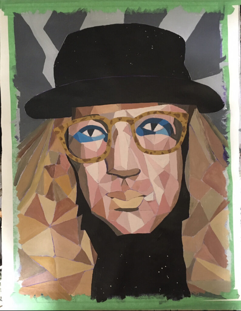
-My Fractured Self-
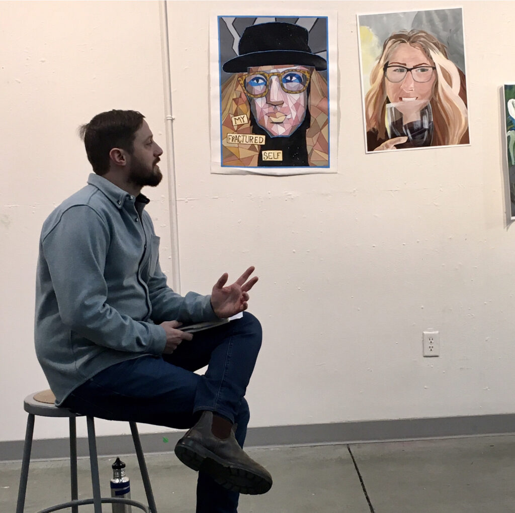
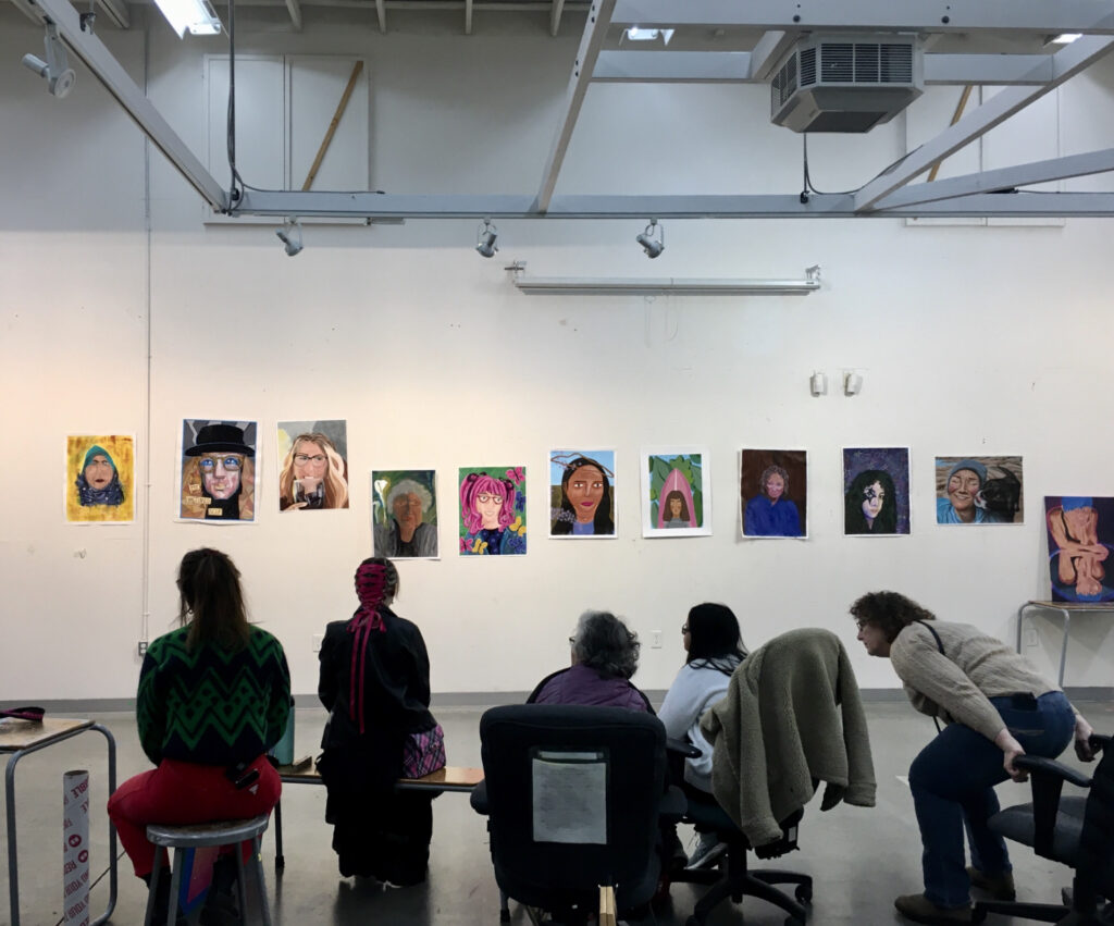
Critique Day
I hung my painting up on the wall with everyone else. It was fantastic to see it with all the other styles. Class mates and the Instructor Scott all said very positive things about my painting. I left the class feeling like “Yes, I can do this.”
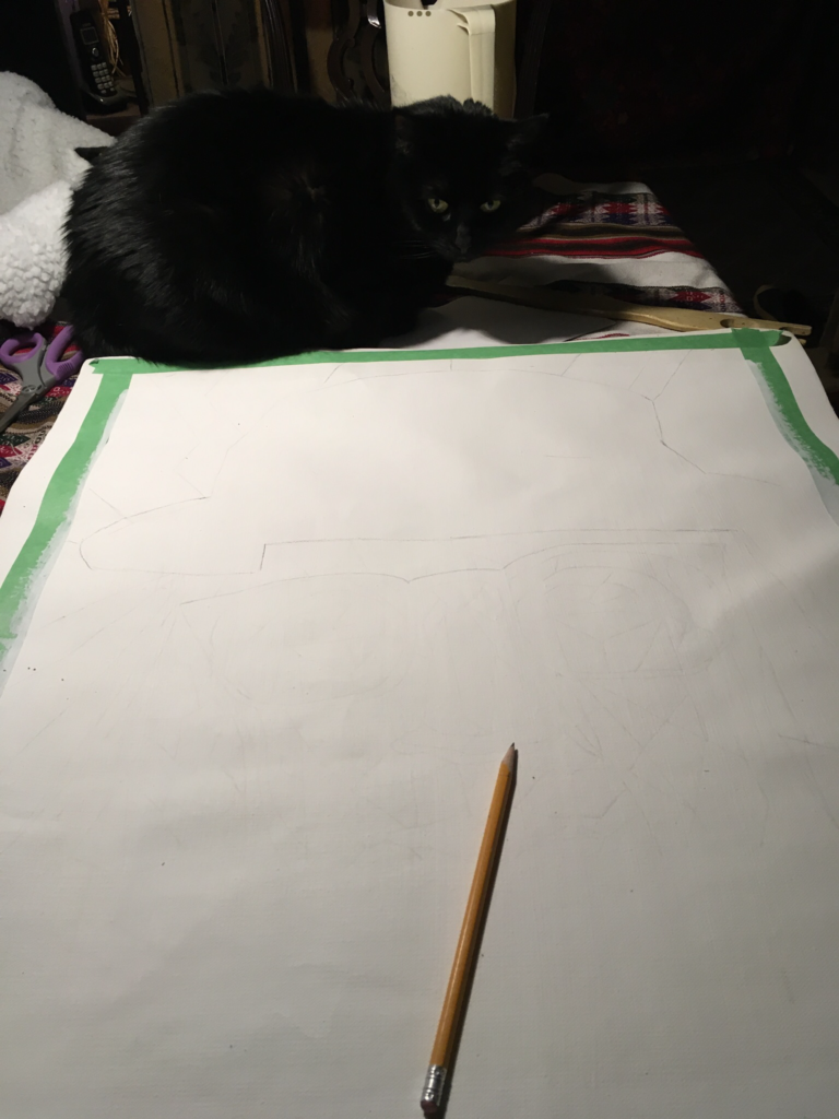
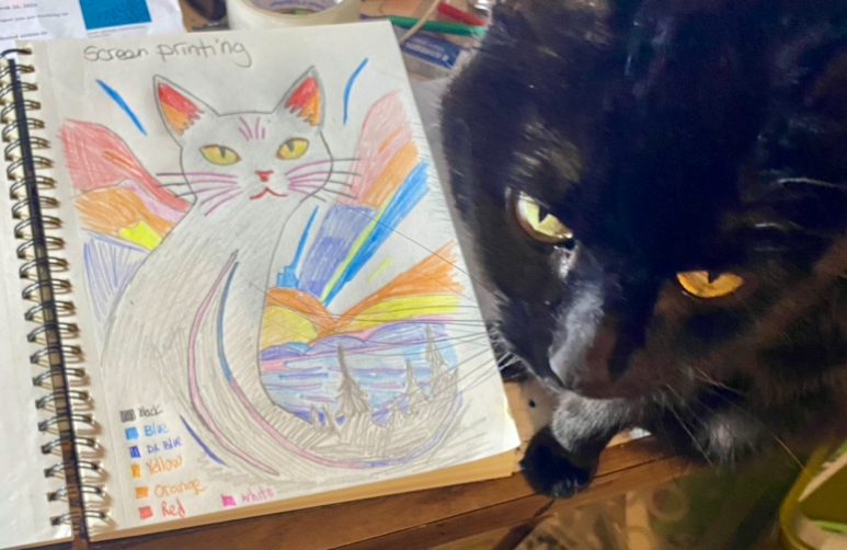
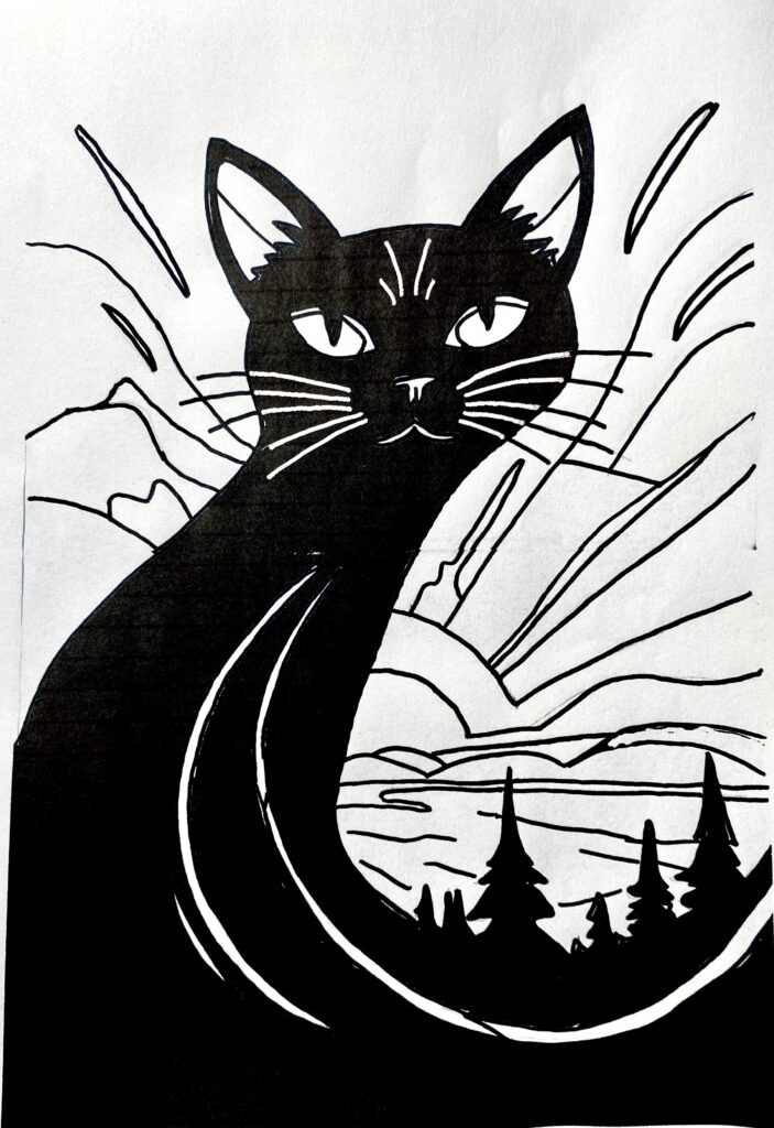
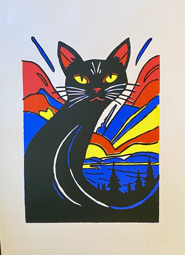
A black cat always lives in this house. Some from a feral population down the road, others from trailer parks up the hill. I like black cats. They are witchy.
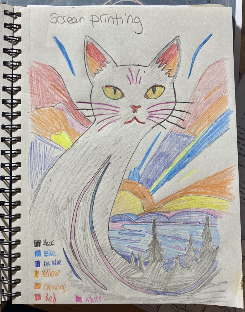
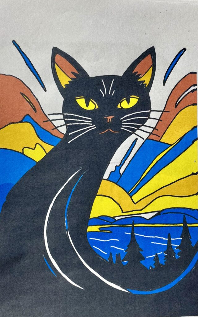
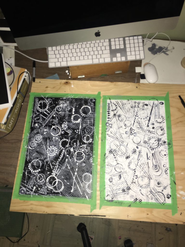
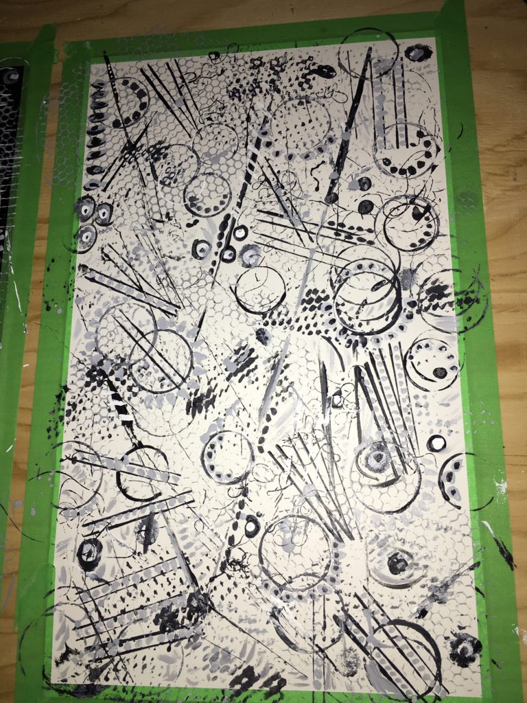
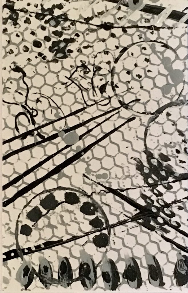
Figuring out colors.
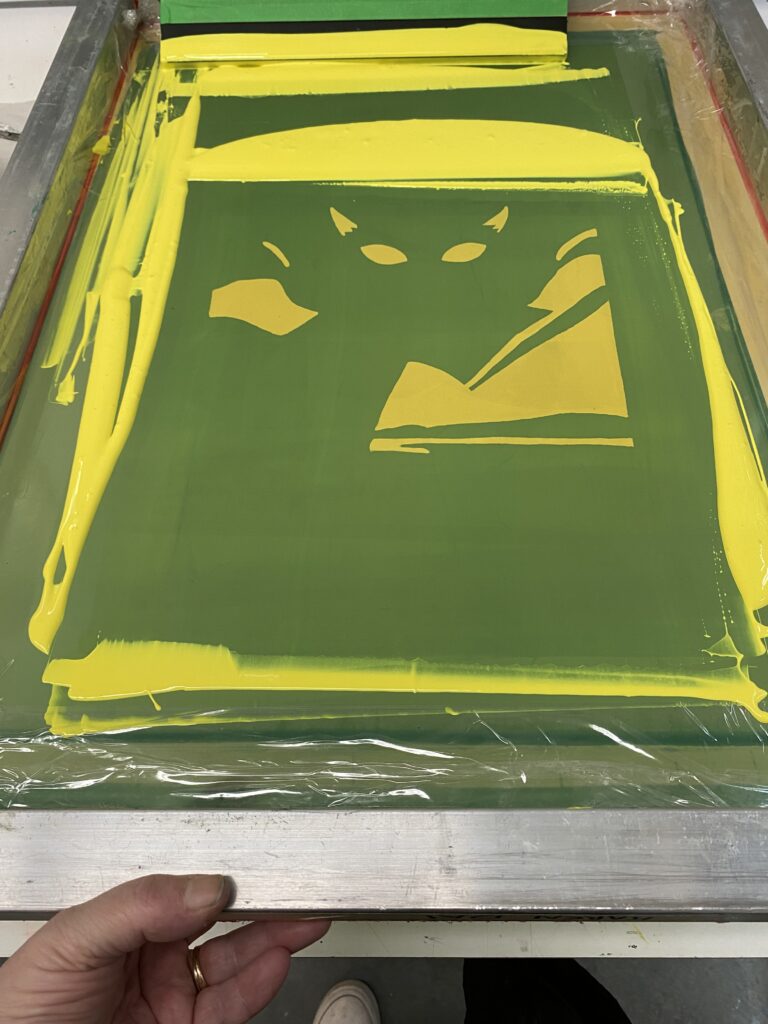
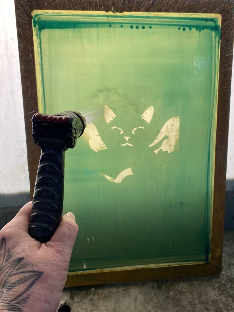
Four screens: Yellow, Red, Blue, Black.
Yellow screen
Red screen (Creating orange where overlaps yellow)
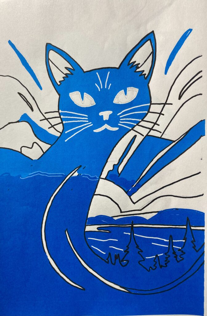
Blue screen (Light blue and dark blue merge in the middle) Provide base for black to sit on.
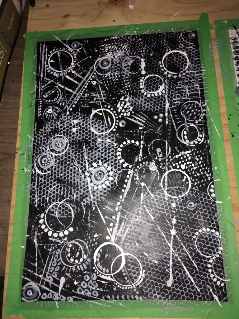
Black screen
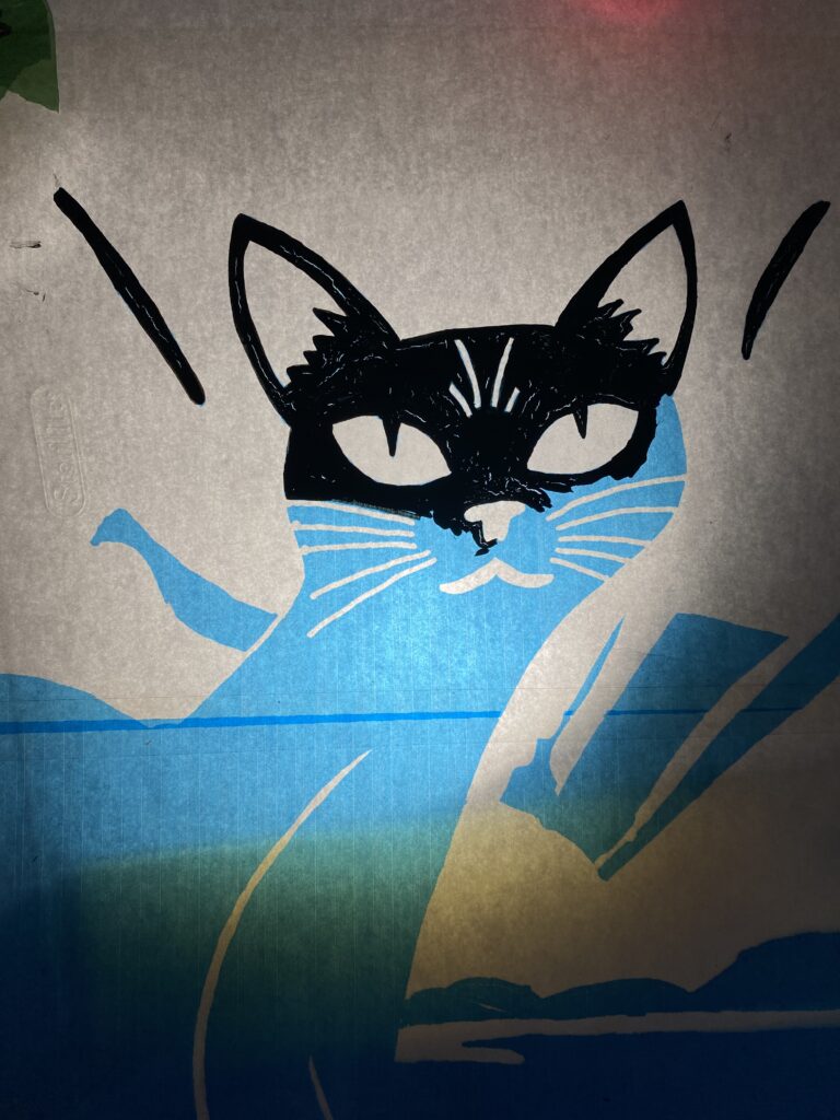
Finished design Matrix. “Glacier Cat”
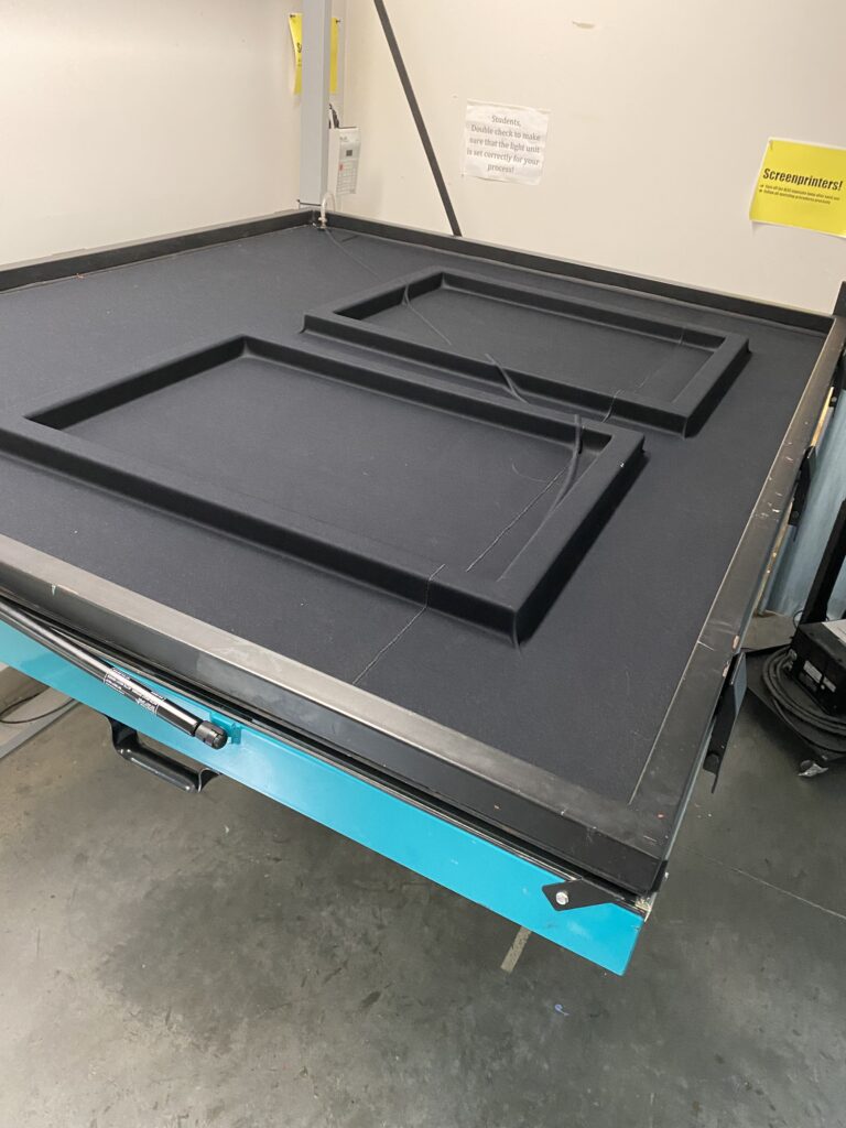
All the paper is cut to the right size and registered with keys.
I used acrylic black paint to fill in the areas on my stencil. It cracked in areas while drying so I filled them in with a second coat of paint.
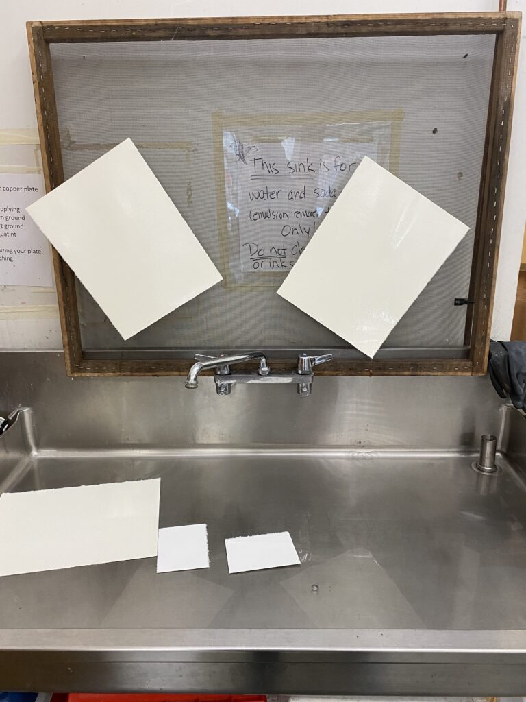
The screen is prepped and then a thin layer of emulsion is rolled on. After it is dried, it is taken over to the light table. Your stencil is placed under the screen. The vacuum is turned on. The table is flipped up on it’s side to receive to sets of UV light treatments. The screen is then rinsed and dried. It is now ready for printing with the ink. When done, the screen is stripped and the process starts again for your next screen.
screens in the vacuum chamber getting ready to be exposed to UV light.
Printing the first screen
Rinsing the screen after washing it with the Willow Strip.
————————————————————————————————————–
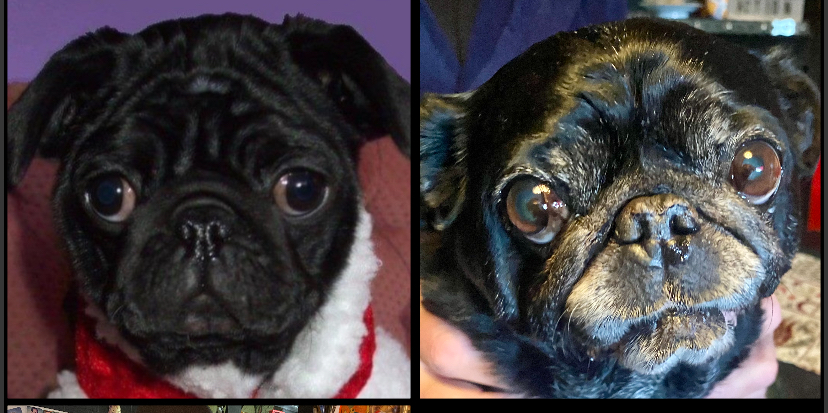
Life ended for me right here. My beloved dog Baby Eve passed away. I had to take a week off to greave her loss. This put me behind schedual with everything. I just did not care.
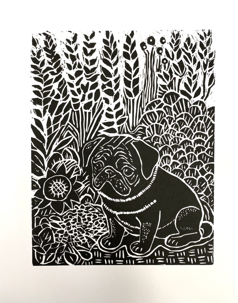
Baby Eve 2011-2024
—————————————————————————————————————
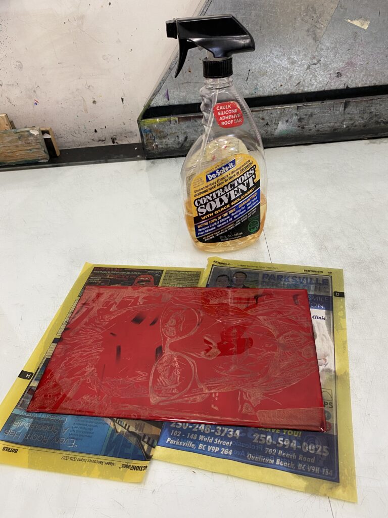
Back in the print studio and just want to get this done and handed in. My mind is numb. I axed the transparent red idea to make orange, and also the blue merge I originally planned. Keeping things simple. I just needed to get this finished.
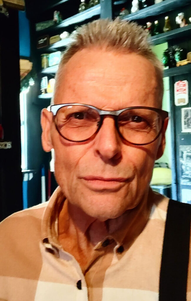
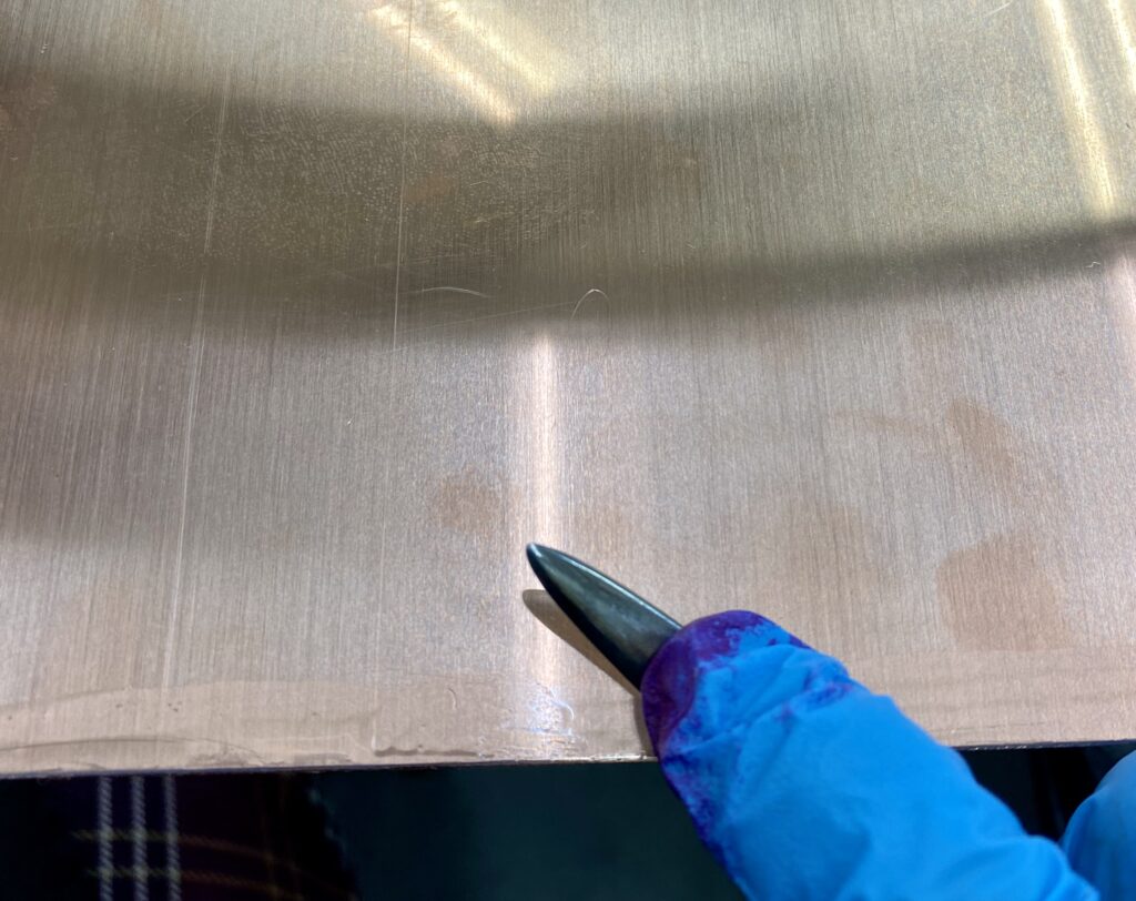
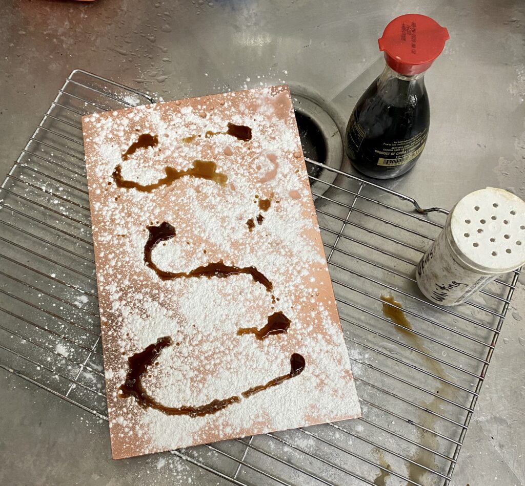
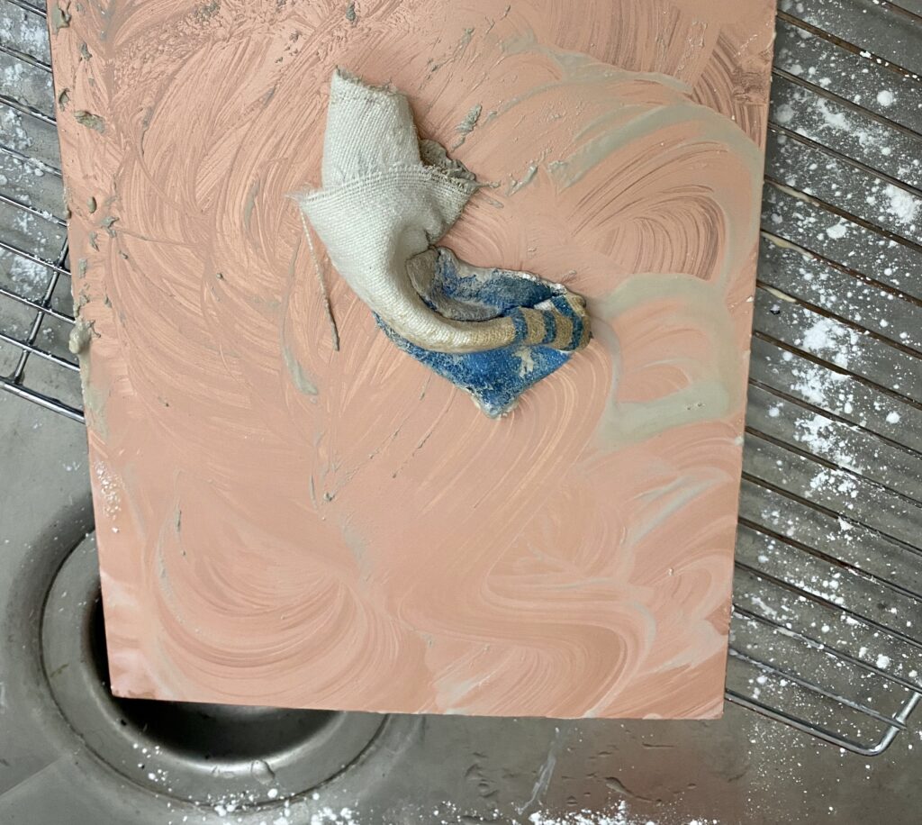
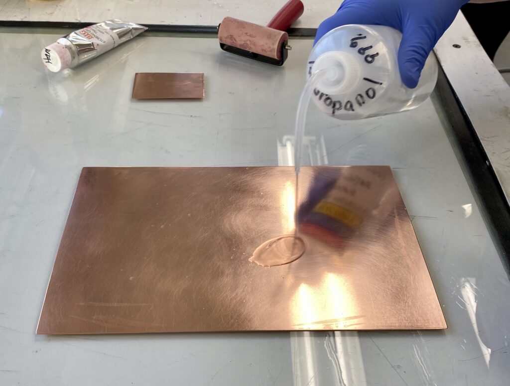
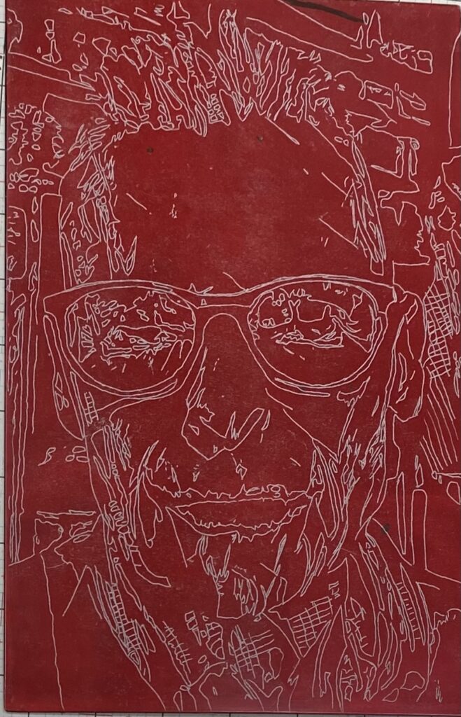
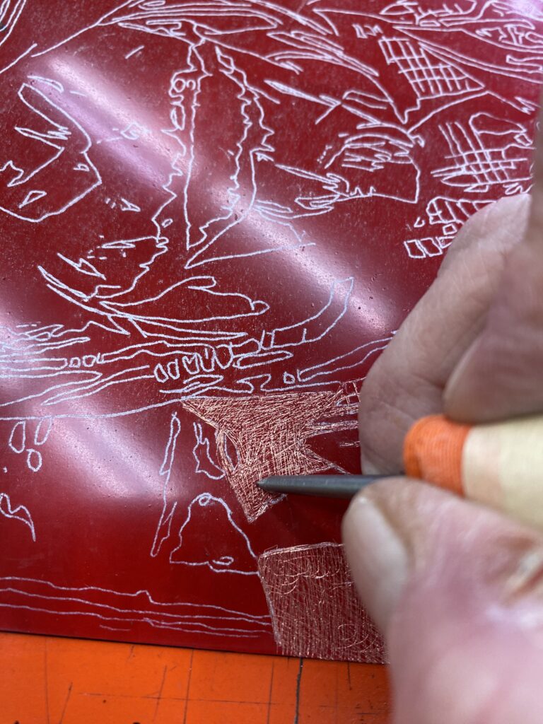
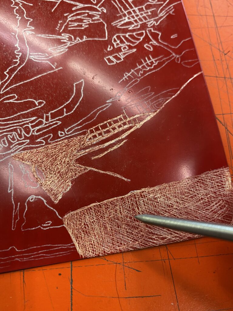
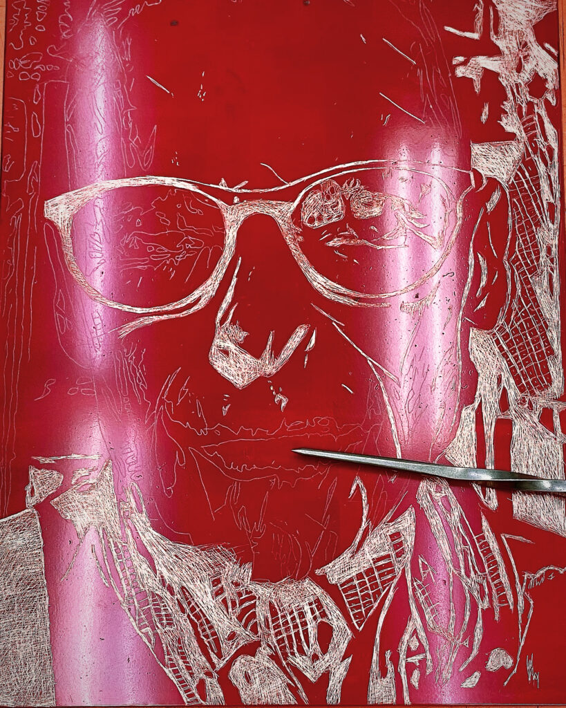
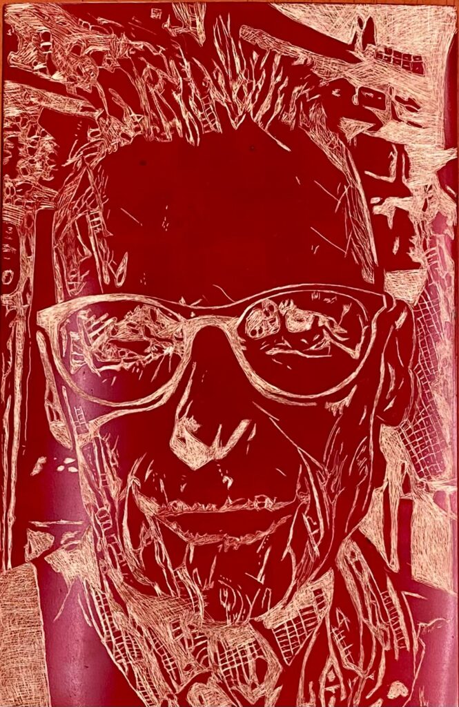
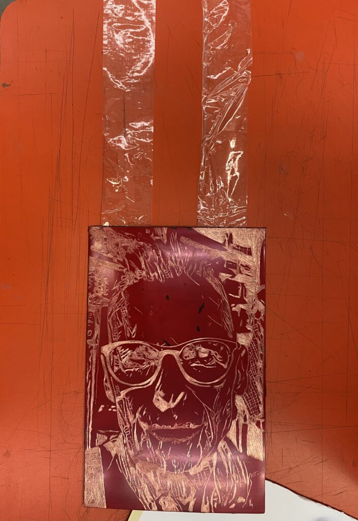
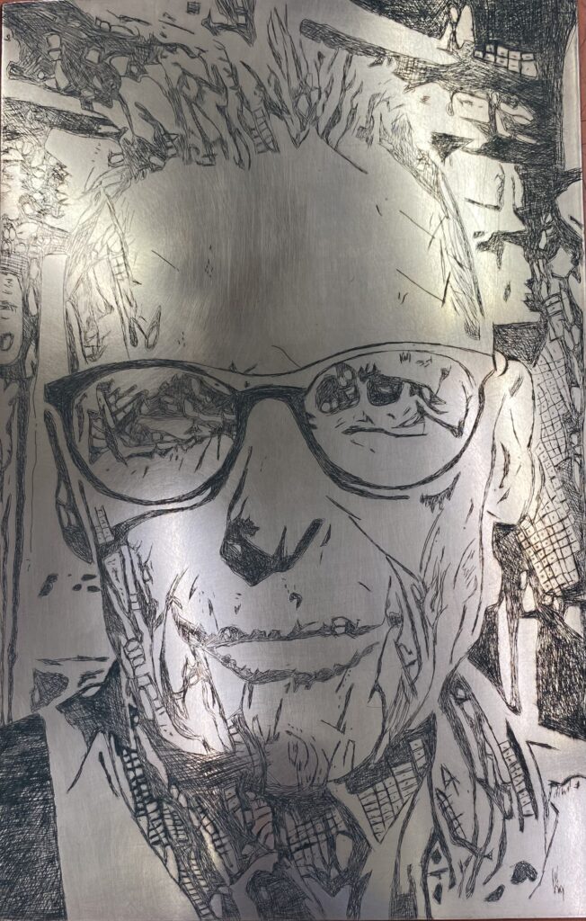
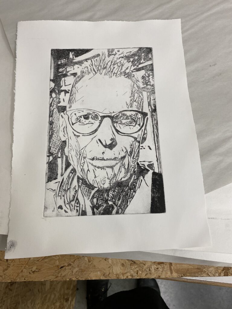
I am going to attempt to do an etching of my husband Nick. I took a photo of him and ran it through some filters to simplify and create a drawing I can transfer onto the copper plate.
Photo of Nick Day 2023
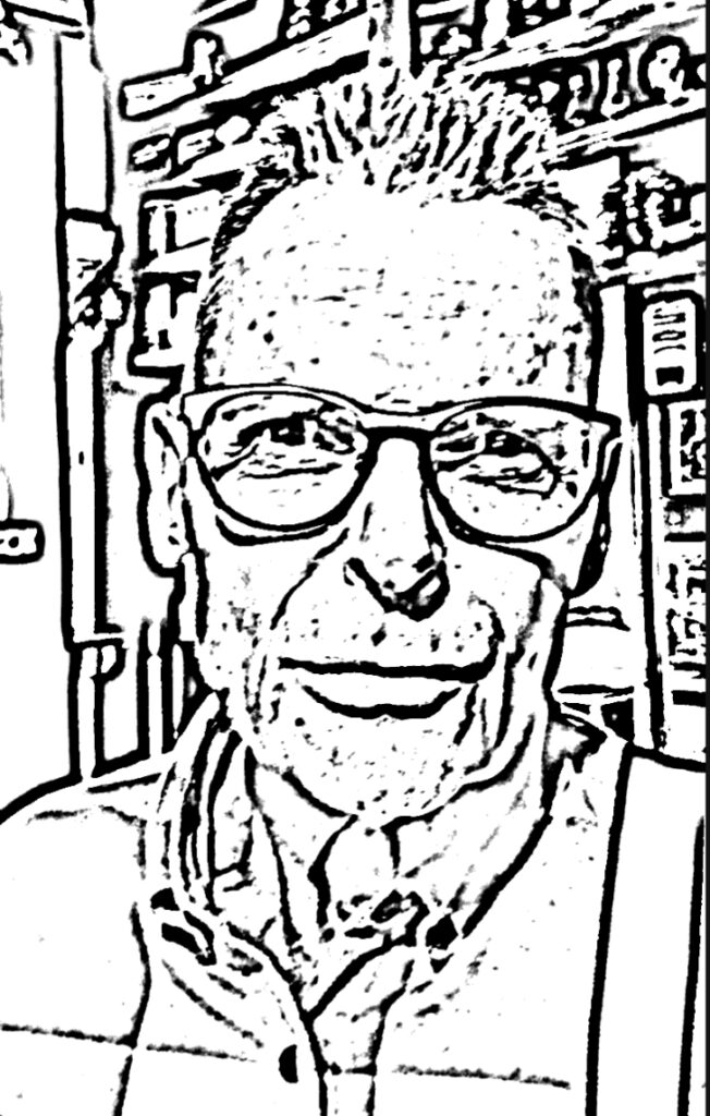
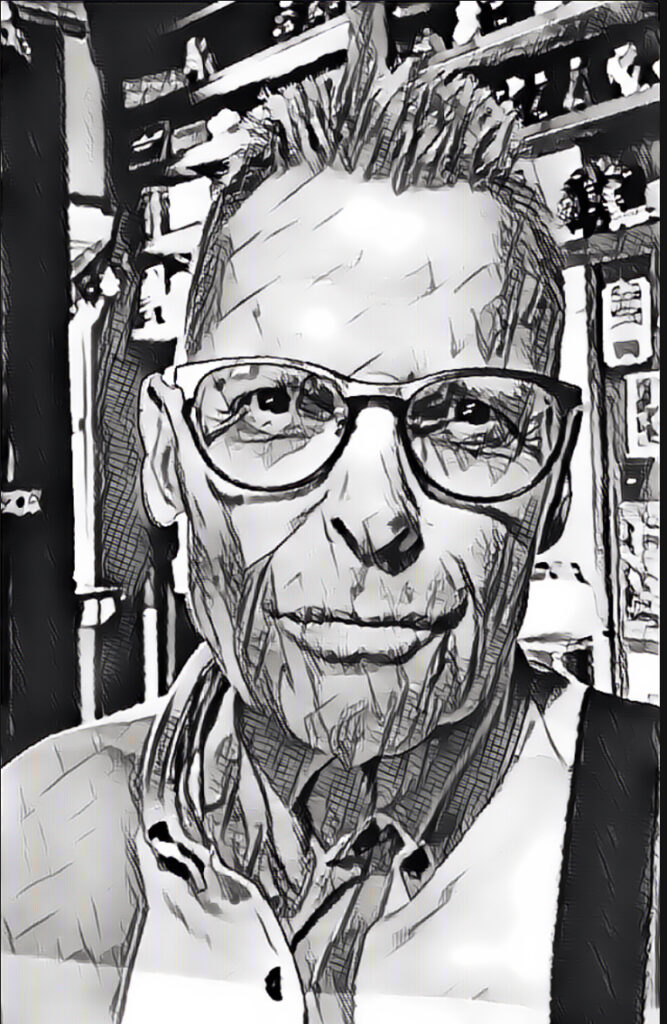
I converted the photo into a black and white line drawing, and also through another black and white filter. I will Probably choose the simpler line drawing, but add in some of the cross hatching details from the second picture.
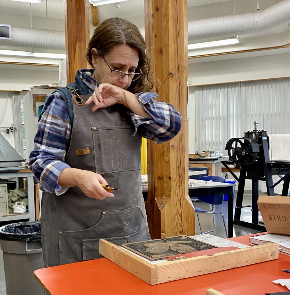
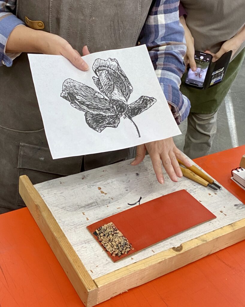
Instructor Linda Perron explaining Relief Printing
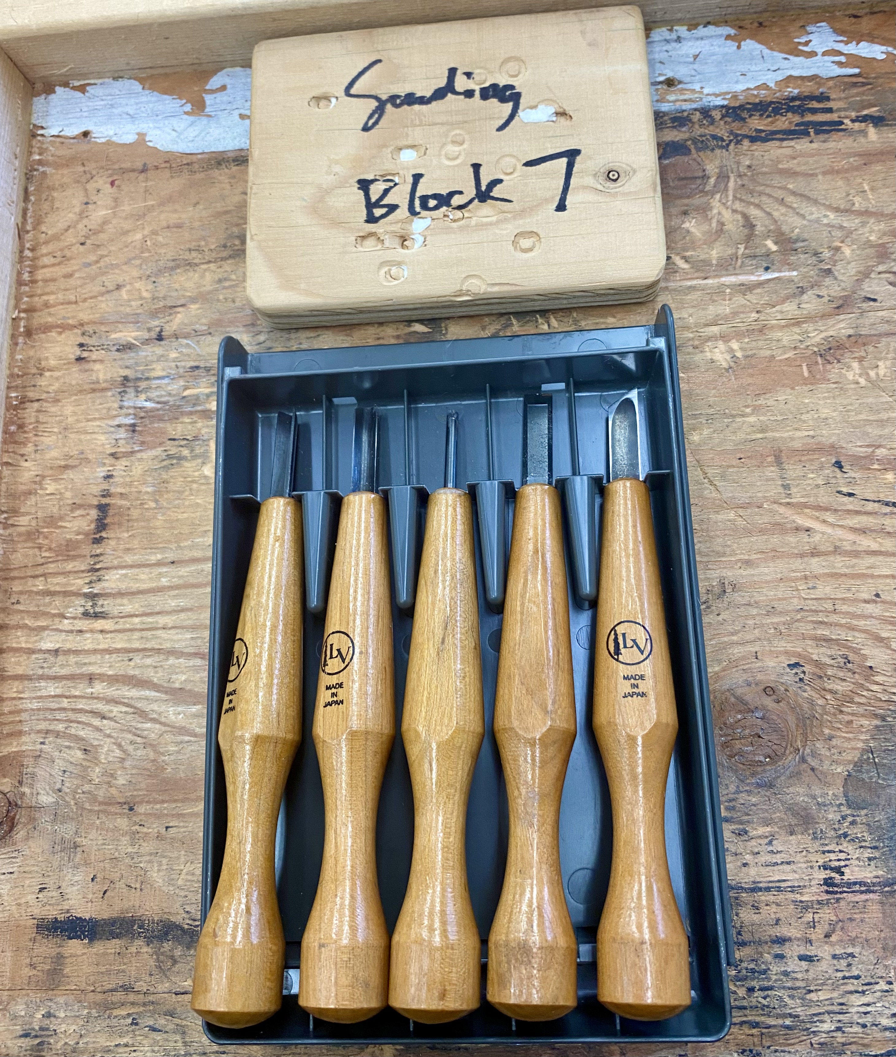
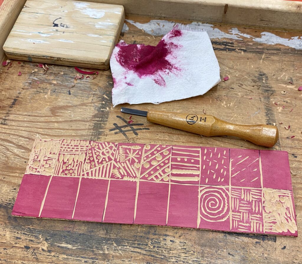
Getting the supplies needed for Lino cutting.
My set of tools I will be working with.
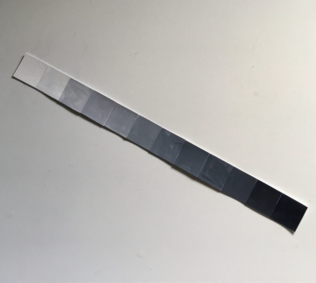
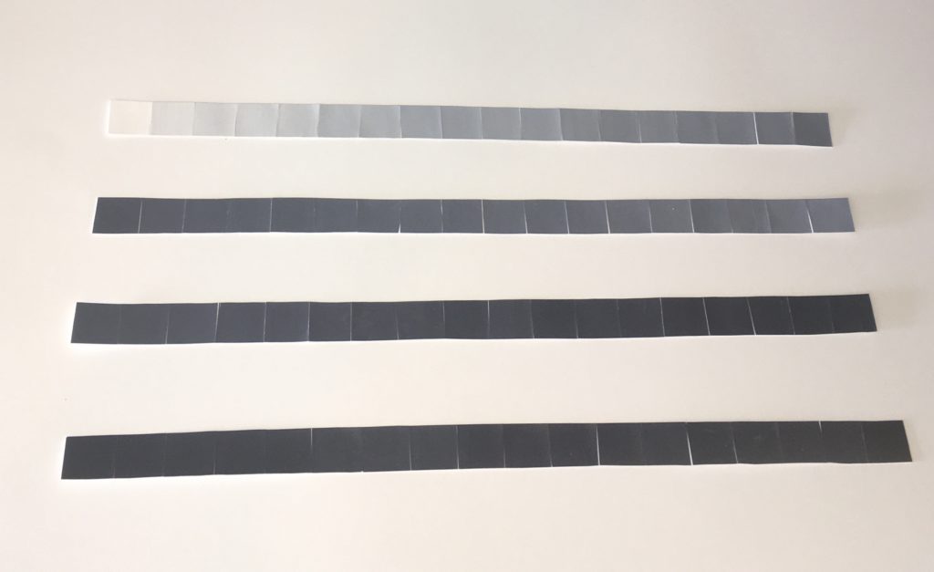
The first exercise is to create a Gradient Scale.
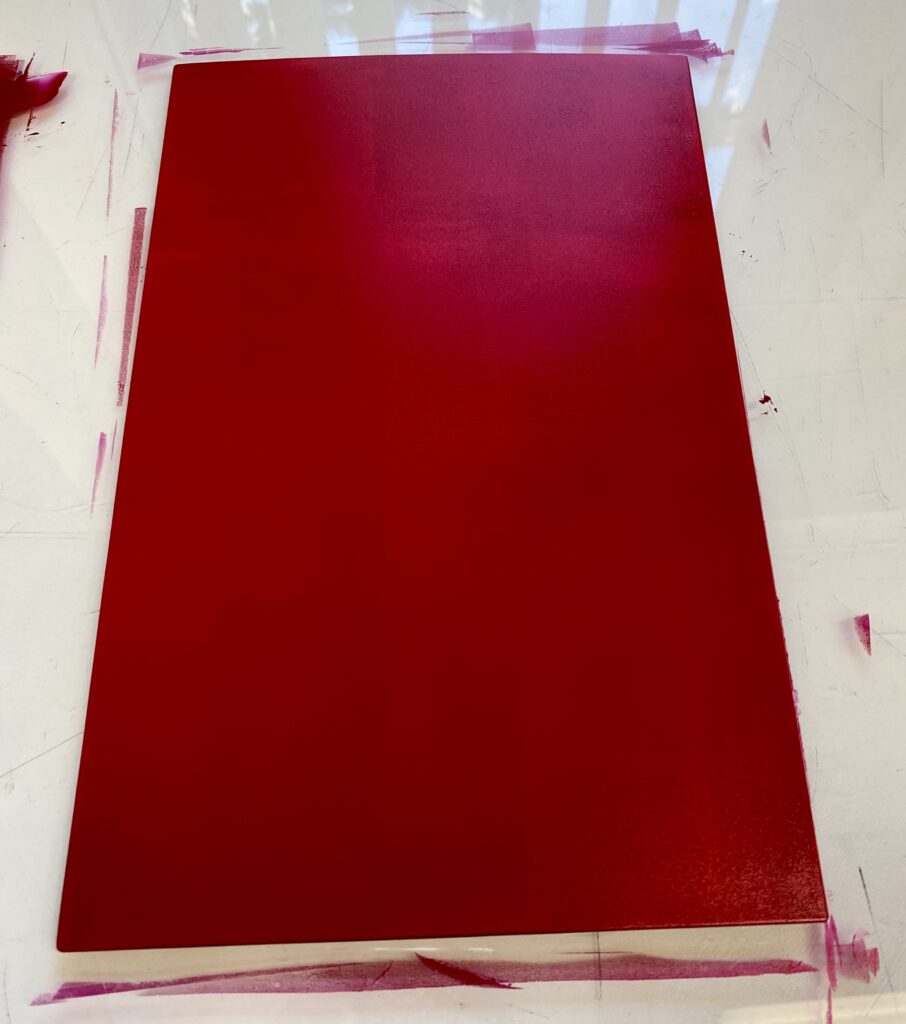
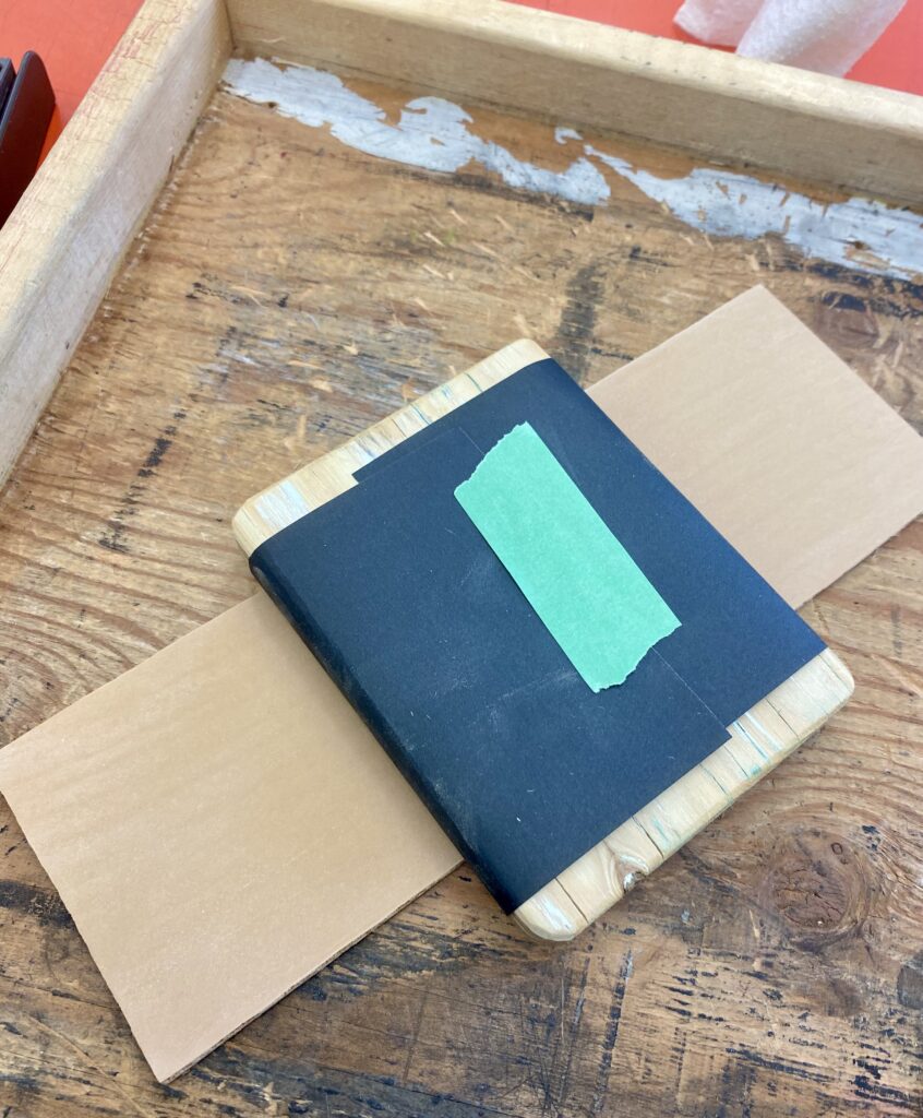
The lino board is first sanded with a 400 grit sandpaper to remove any bumps or blemishes on the surface.
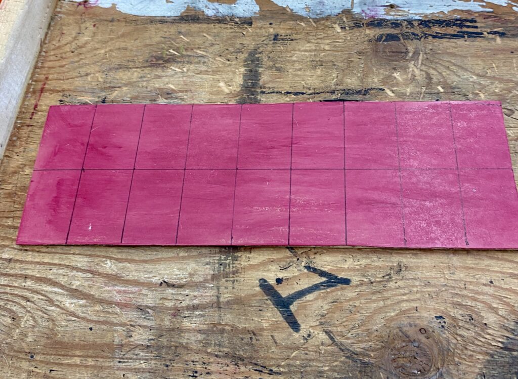
Acrylic red paint was painted onto the surface to aid with contrast during carving. The board was marked with a pen to create the grid.
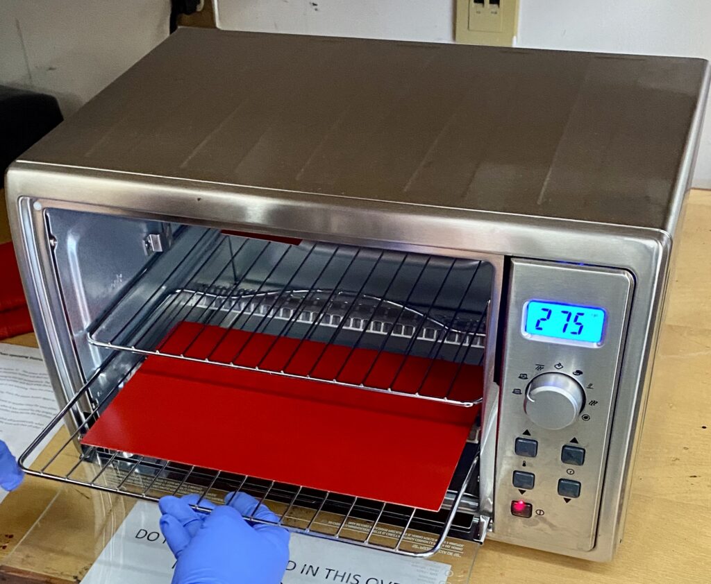
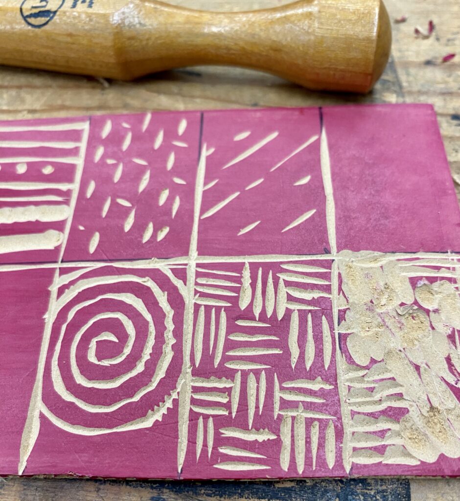
Creating marks with the tools! It was harder than I thought it would be. The room was also cold which caused the matrix (board) to be harder. After warming up the lino on hot plate, I experimented with the different tools to get an idea of what they could produce.
Close up of some marks into board.
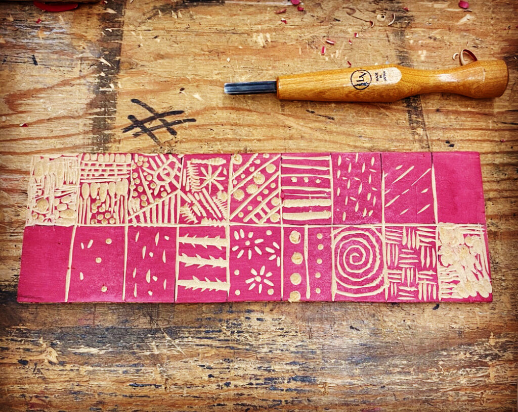
Finished Board ready for Proof printing. I enjoyed making circles.
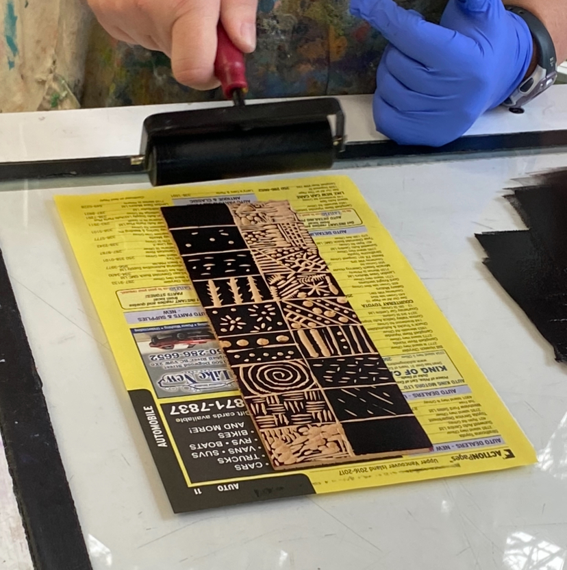
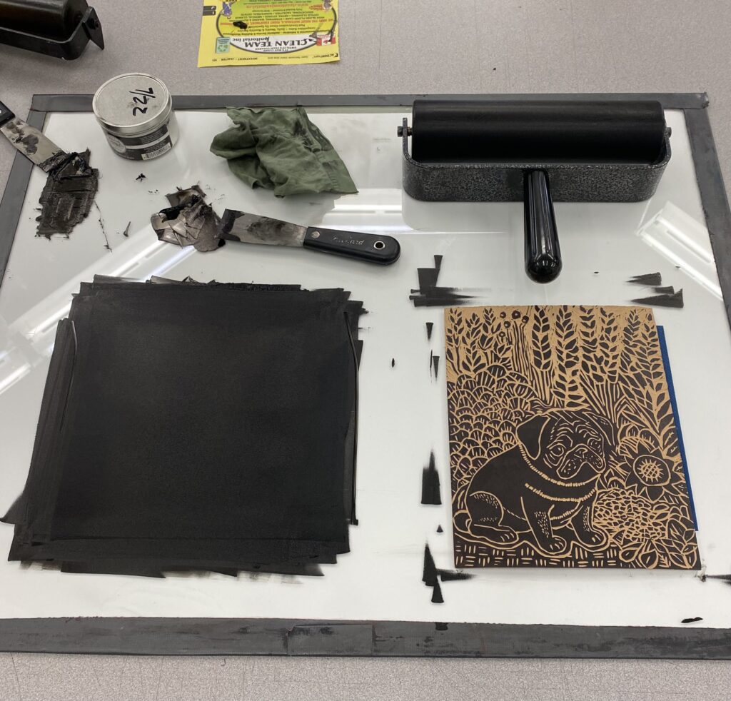
Using a brayer to ink my matrix.
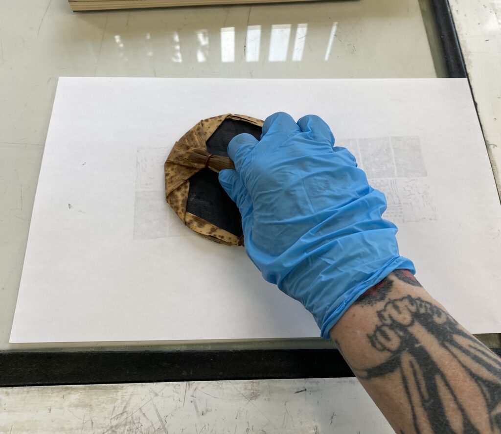
Rubbing the paper with a baren to help transfer the ink onto the paper.
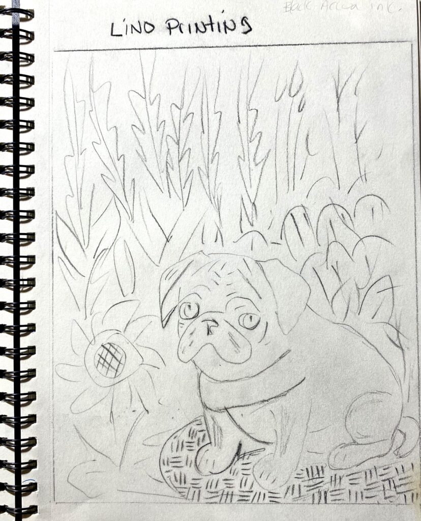
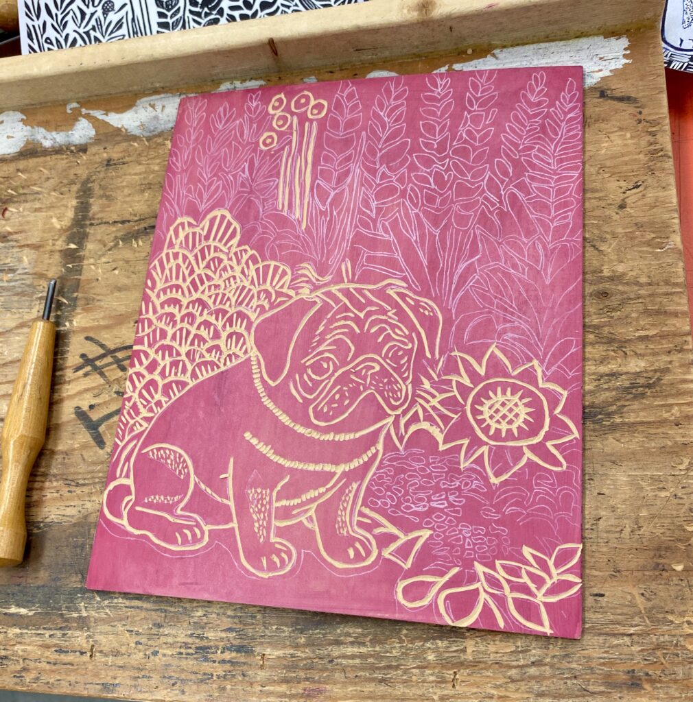
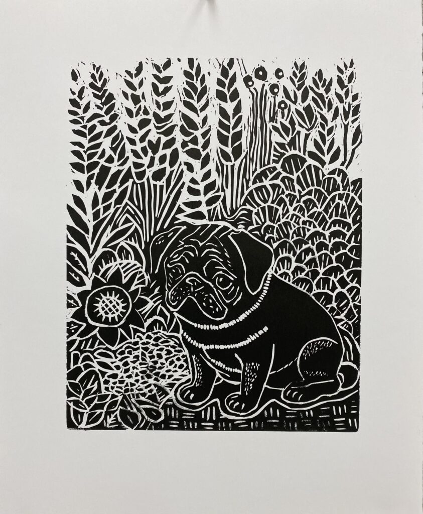
Now it was time to work on a bigger piece. I chose to use baby Eve as my model.
Sketchbook drawing of what I wanted to attempt.
After getting the image where I wanted it, I used the photocopier to create a mirror image, and to reverse the color. This was then traced onto the prepared lino with white tracing paper.
picture transfered, and board ready to be carved.
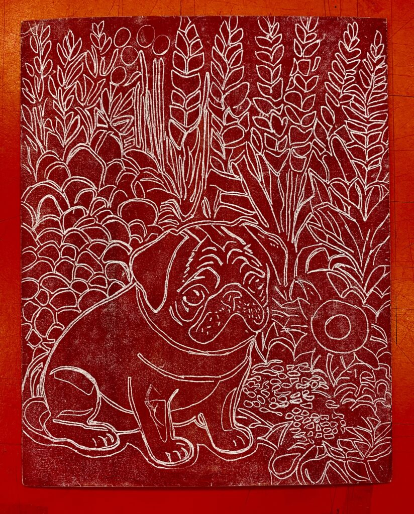
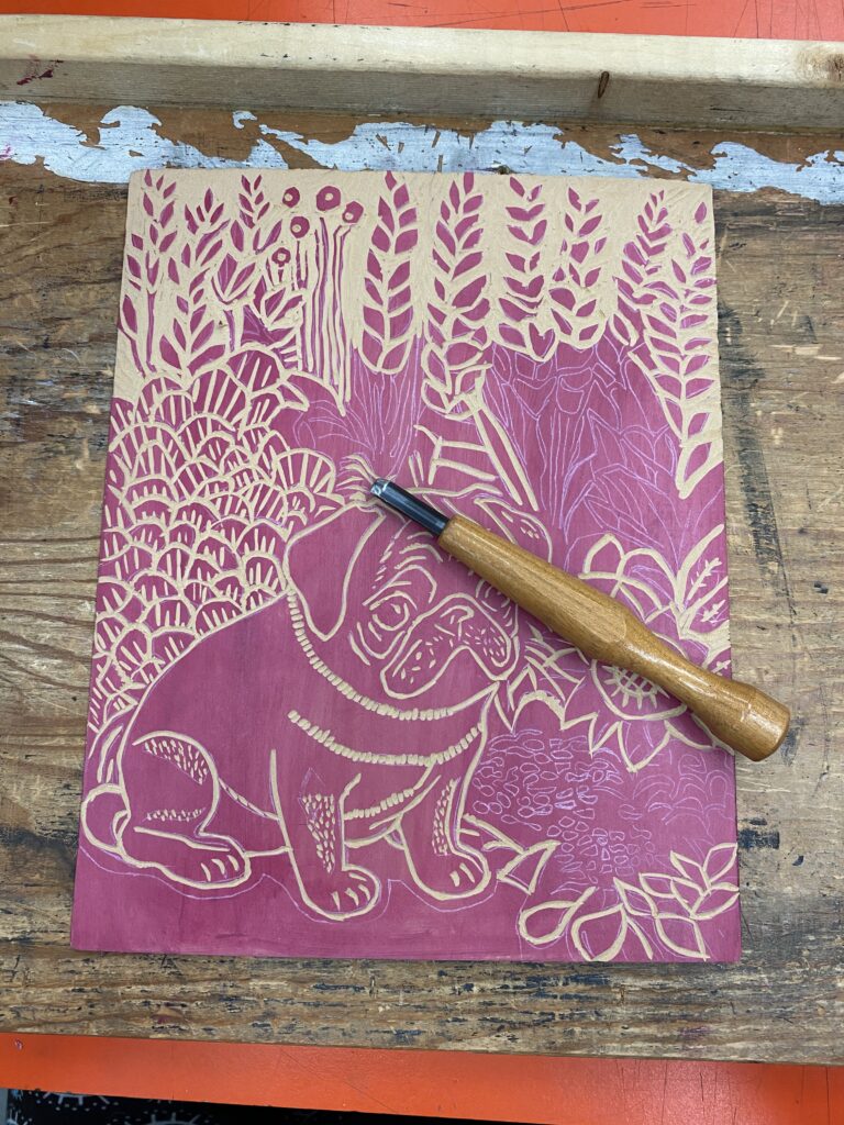
I started with the dog first and then chose random areas around it to carve. I used all three tools in this carving.
The board carves better when it is warm, and your tools are sharp.
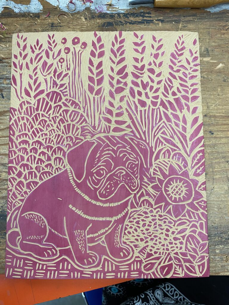
It took about 4 hours of carving to get to this point. I used a toothbrush to remove any small bits of debris away from my carving.
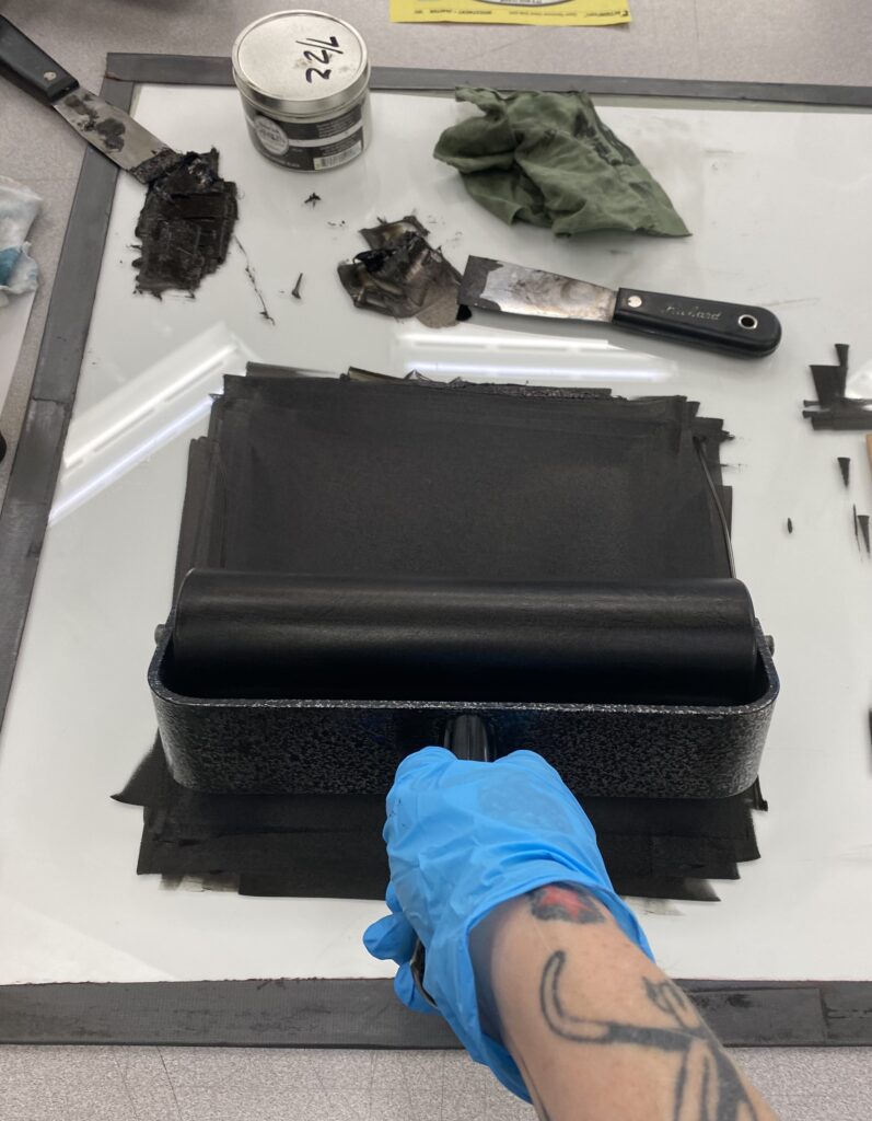
Spreading and opening up the ink
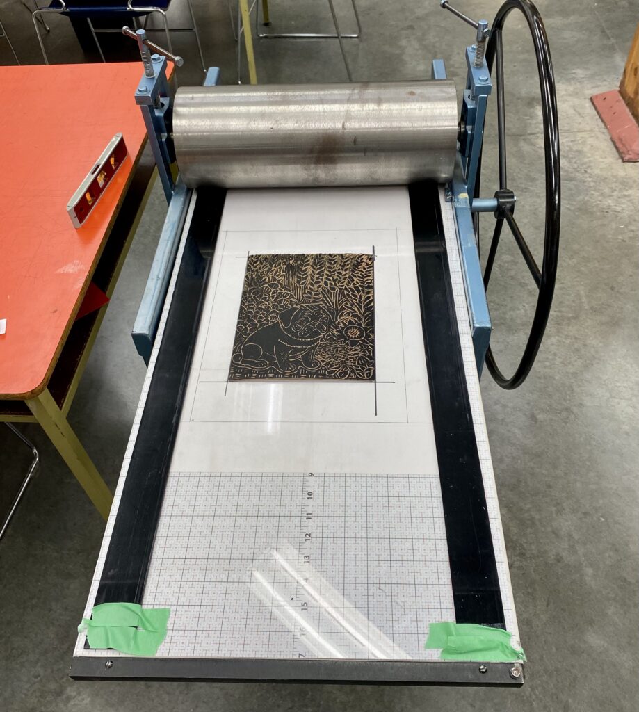
Ready to move over to the printing press.
Lining up within the template
Paper layed over top inked matrix. Extra sheet of cardstock and newsprint added on top.
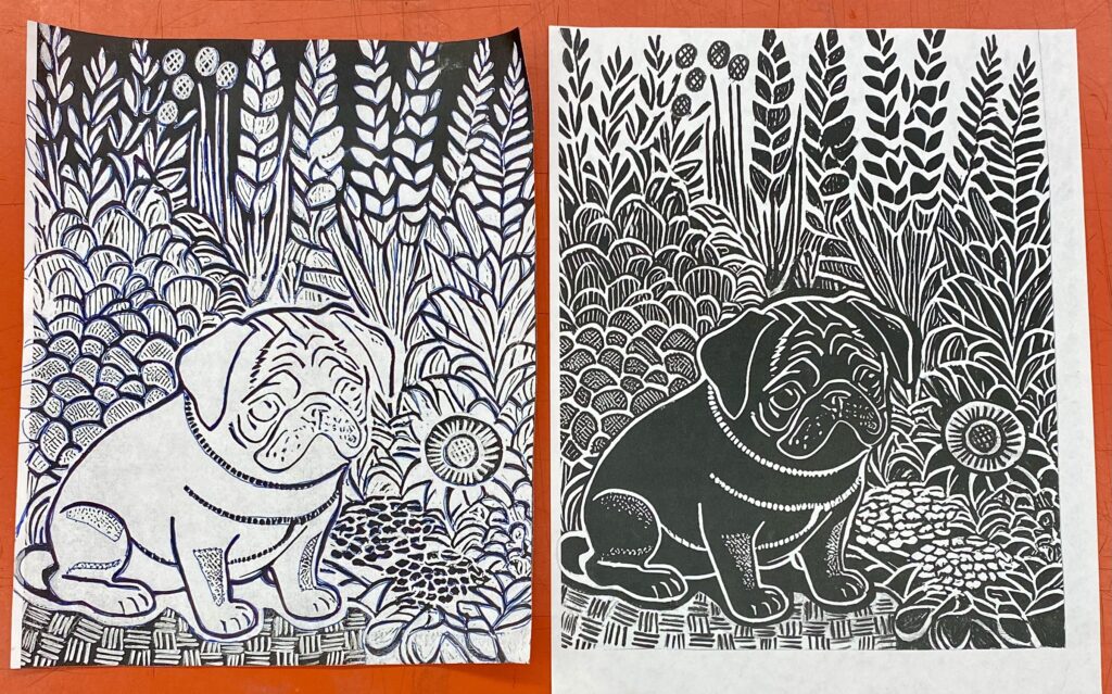
First poof. I needed to go in and carve the lines darker on the far right corner. I also changed the top neckline to include more little cuts.
Next printing after revisions.
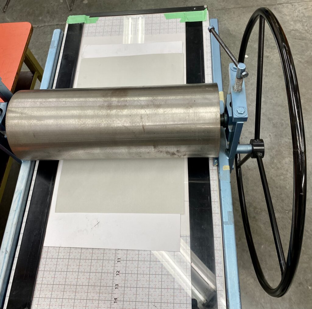
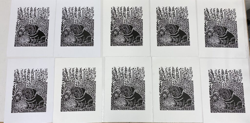
Getting into a groove and making prints on the Stonehenge Paper.
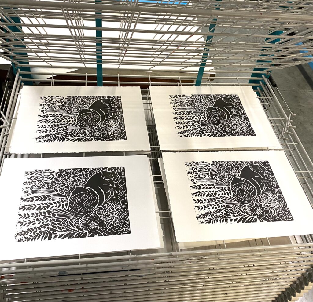
Prints in the drying rack curing.
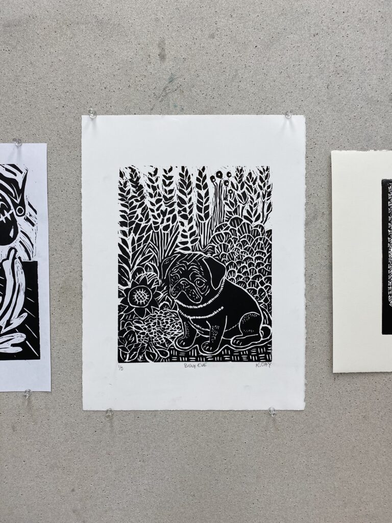
Print 1/5 Baby Eve K Day on the wall for class critique day. it was great hearing what people had to say about it, and looking at everyone else’s work.
I enjoyed the process of Relief Printmaking. I found it to be very meditating carving the matrix. My biggest challenge was trying to keep everything clean. I am a messy worker. The prints that did manage to come out ended up getting blood on them from my split fingers. In the end, I picked out the best 5 prints for my series to hand in for the unit.
-deconstructing objects is not an act of destruction or rejection of them.
The artist is trying to bring us out of our familiarity (visual habit) by destroying and reconstructing this habitual vision so that our vision can be extended to other images.
This reminds me of the concept of Memory Mind in psychology. Can we ever see things anew? This artist takes things that we have seen and stopped seeing, and mixes them up for a new exciting adventure for our eyes.
I am new to this, and find myself being very rigid in my applications. I hope to experience a breakout and be more liberal with my use of materials and techniques. To allow myself to express and not worry so much about the outcome.
Citations
www.kimbyungkwan.com
www.saatchiart.com>kimbyungkwan
issuu.com>photographize.mags.docs Hub, Fudo. Issue 42 September 2019
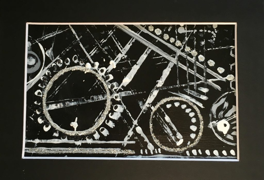
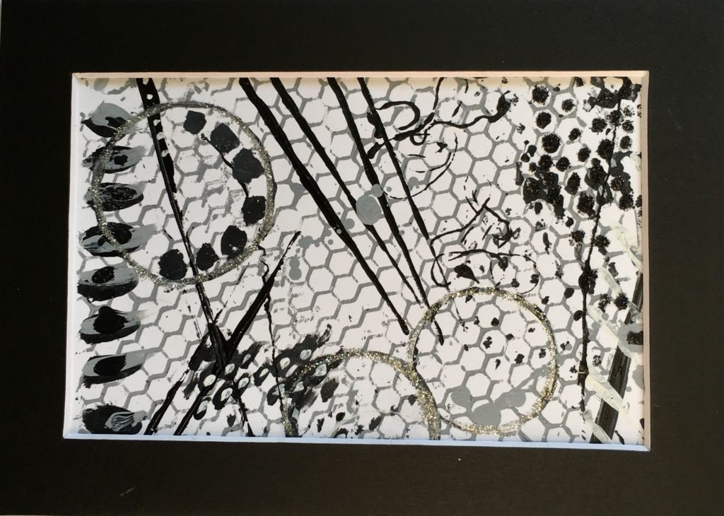
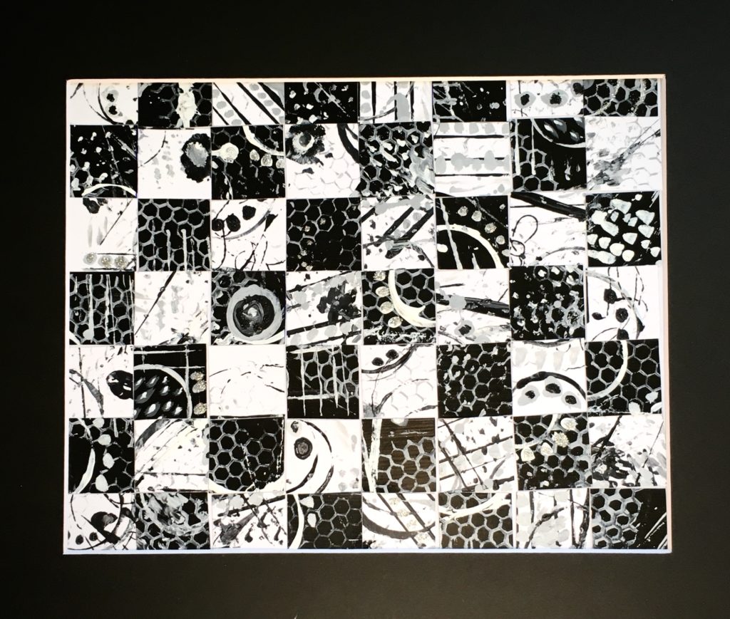
Grey scale and abstract paintings and 2 samples from the paintings and a piece of art made from both pieces.
Grey scale strip 72 step Grey scale stripOne dark, one light greyscale abstractBlack background abstractSelected pieceTitle: My Bike. 4.5″ x 6.5″ Acrylic paint and glitter on cardstock. White background abstractSelected pieceTitle: Orbs. 4.5″ x 6.5″ Acrylic paint and glitter on cardstockCombination piece Title: The Pollination Game 8″ x 10″ Acrylic paint and glitter on cardstock
-1907 Klimt becomes his mentor and a close friendship ensues.
-Both artists share similar traits (drew elongated bodies), and techniques (used expressive lines and bright colors).
-Moves towards new style of Expressionism.
-Used Auguste Rodin’s continuous drawing technique to create figurative sketches.
-Noticeable Klimt influence in work produced 1907-1909
-Models were often people he knew. eg wife, sister, and lovers.
-1912 The Hermits (Self-Portrait with Gustav Klimt) Homage to their friendship.
–1912 police confiscate hundreds of drawings due to their sexually explicit nature. Charged with public immorality and sentenced to 24 days in custody.
-Feb 1918 Gustav Klimt dies and Schiele paints his deathbed portrait.
-Last drawing is of pregnant wife Edith on her deathbed Oct. 28, 1918. (Spanish flu)
-Dies Oct. 31, 1918 from the Spanish flu
-1933 Adolf Hitler comes into power and orders the Nazi to seize artwork he did not approve of. He rejected artwork that was not his classic human beauty ideals. Schiele’s drawings are classified as Degenerate Art and sent to be disposed.
Analyzing Art Work
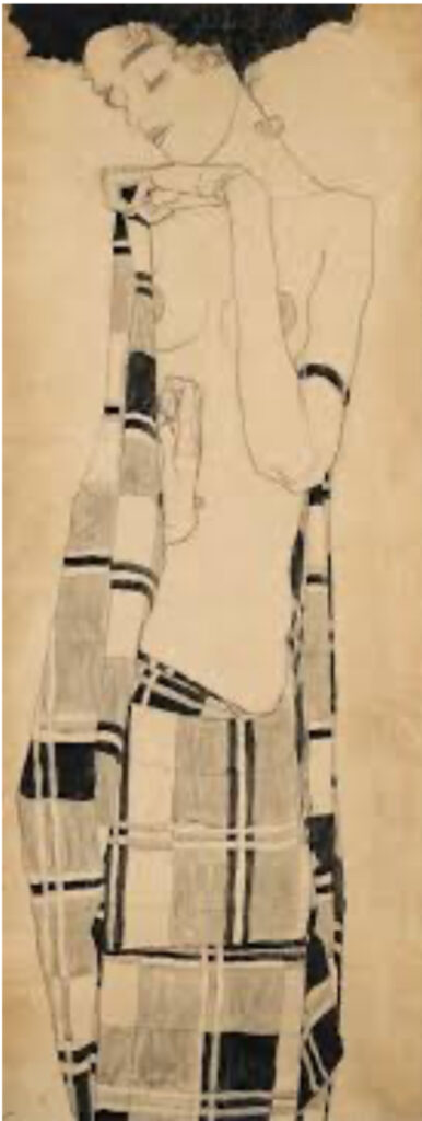
Egon Schiele, Standing Girl, 1910. 52 3/8 x 20 5/8 in. Conté crayon and tempera wash over black chalk on brown wrapping paper
-My first impression of this work is a feeling of serene beauty. The shape and style remind me of a Gustav Klimt artwork. Then I see those creepy large elongated hands and I feel confused.
-The standing girl is bare chested and draped at the waist with a plaid cloth. She is looking down with eyes closed. Her hair balloons out like a cloud. She is rendered in a representational Expressionism style.
-All that empty negative space is confusing to me as it adds no context to where the figure is standing. It adds to my feeling of unease.
-Is it a Transgender person?
-This artwork was created on brown craft paper. Black chalk lines were laid down then Conte crayons and tempera wash are used overtop to add color. The color is all in a similar tonal value. The line work is bold on the body outline and muted on the fabric.
-The long rectangle size of this artwork is surprising. The use of a roll of craft paper gives plenty of length to stretch out the torso.
-I find the plaid fabric to be very chaotic, but it does allow a pathway for my eyes to travel back up the painting to her hand.
Final Impression: As this was his earlier work, the influence of Gustav Klimt is strong. His use of distortion is carried through his artwork. This is a drawing of his sister.
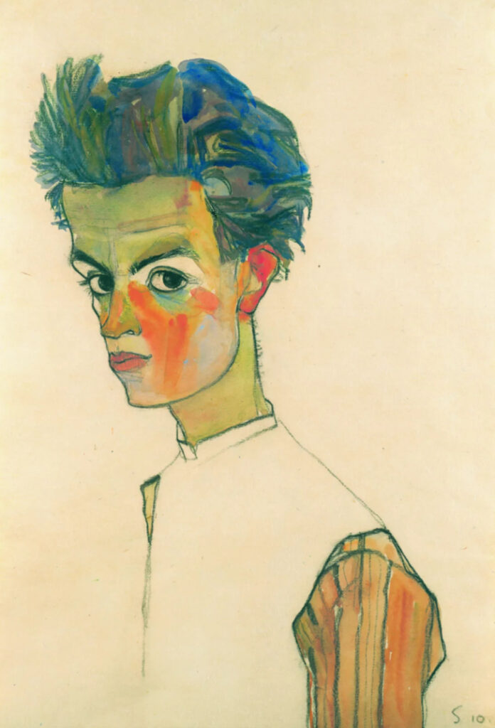
Egon Schiele, Self-Portrait with Striped Shirt, 1910. 443 mm (17.44 in); x 305 mm (12 in) Black chalk and gouache on paper
My first impression of this artwork is a feeling of youth and optimism.
When I look at this artwork I see a young almost naive looking young man with big questioning eyes looking right at the viewer. I like the use of negative space in the background, and how parts of the body are left uncolored.
The subject matter is a representational artist self portrait.
Black chalk was used to create a heavy outline. Gouche paint added color to the portrait. done on normal size paper.
Schiele painted the striped sleeve in similar colors he used on the head. This helps to balance the colors used on the head. He used shades of purple in the brown hair to add shadows. lots of high contrast in the color placement
Painting the colored sleeves and not the torso draws the eyes downward from the head. It makes a triangle. head, left sleeve, right sleeve, back to head.
Leaving the background blank, and the torso uncolored, all the focus is drawn to the head.
I feel this is a strongly balanced piece. The vivid colors in the face contrast well (red, blue, orange). He knew how to use color well.
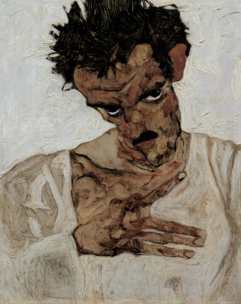
Egon Schiele, Self Portrait with Lowered Head, 1912. 42.2cm x 33.7cm oil on canvas
My first impression when I see this painting is a portrait of an angry man. There is an emotion portrayed of anger or unhappiness. The subject matter is another representational self portrait. This one is so different from the last self portrait. Look at that little Charlie Chaplin mustache. Later to be appropriated by Hitler and forever stricken to be distasteful to wear in the fashion world.
This is an oil painting on canvas in an Expressionistic style. You can see the raised brush strokes from the Impasto technique he used. The large brushstrokes add to the jarring feeling of this painting. This self portrait has those long weird hands again. And where is his thumb? The color is monochromatic.
I find the whole mood of this painting to be angry. Those angry staring eyes under furrowed brow are staring right at the viewer are the focal point. The hair is dark and sticking up. His white shirt looks dirty and undone. What is the deal with that one finger so far apart from the others? All questions I have from his design choices.
My final impression is even more jarring and emotional than my first. I realize this self portrait is triggering to me with my PTSD. A very angry man looking straight at me with aggressive hand actions and I don’t know why and I don’t want to get hurt. Body language is so telling. As it says in the title ‘with Lowered Head’.
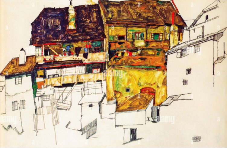
Egon Schiele, Old houses in Krumau, 1914. 32.5 x 48.5 cm. gouache and pencil.
He mostly painted portraits, but did do a few landscape drawings
I learned Egon Schiele believed that nature had Anthromorphic qualities. His landscapes had much in common with his portraits. Jagged outlines, isolation of subject, staring eyes/windows. He searched for the divine within nature. This got me thinking “Can people look like their house?
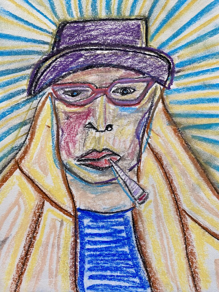
I liked the colors Egon Schiele put into his self portraits. It inspired me to draw a quick self portrait of myself in chalk pastel and use colors in the face. (I must say that after the last round of Prednisone I had to take that caused a 10lb weight gain, I have been avoiding my fat face.
Guest Artist Val Nelson came and spoke to the class. Unfortunately I could not attend.
Here is some artist info on this Canadian painter.
A former dancer with the Royal Winnipeg Ballet
Studied Media Arts at Emily Carr University, graduated 1988
Made dance videos for 12 years.
Switches to painting and is a finalist in 2003 for the Royal Bank Painting Competition.
Paintings published in various publications
Work is included in the collection of the Canadian Council Art Bank.
Paintings are in various galleries. Vancouver General Hospital and private collectors.
Val moved to the Comox Valley from Vancouver in 2021.
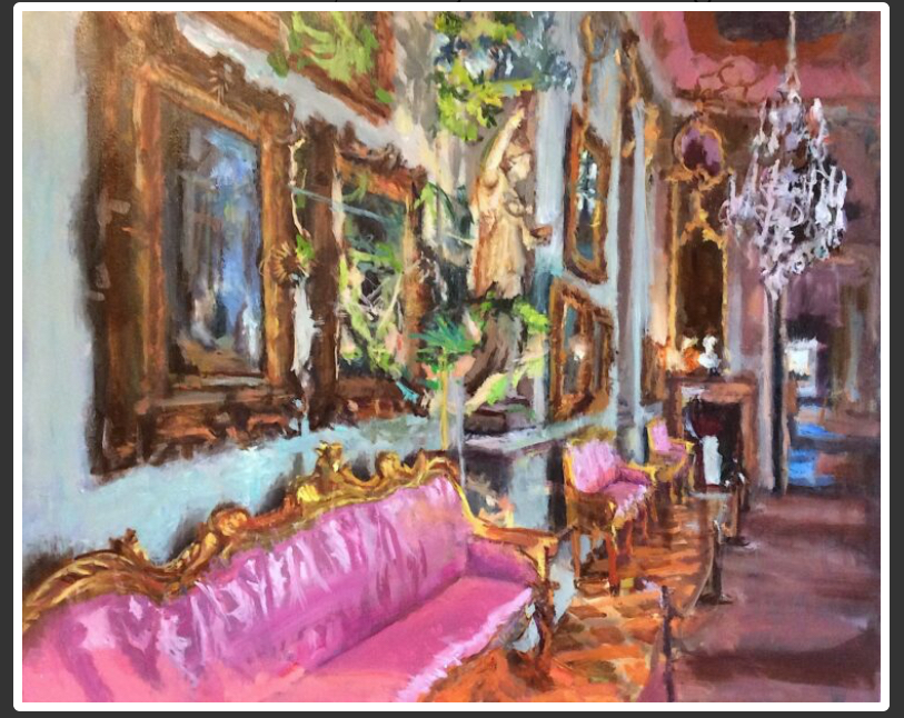
Val Nelson, The Light of Truth, 2022, oil on canvas, 24×30 inches.
I am enjoying the visual of this long side view of the room. Her perspective is spot on. I am in love with that couch, and the opulence of the room. The one thing that is bugging me about this painting is the chandelier is either hanging weird or not balanced.
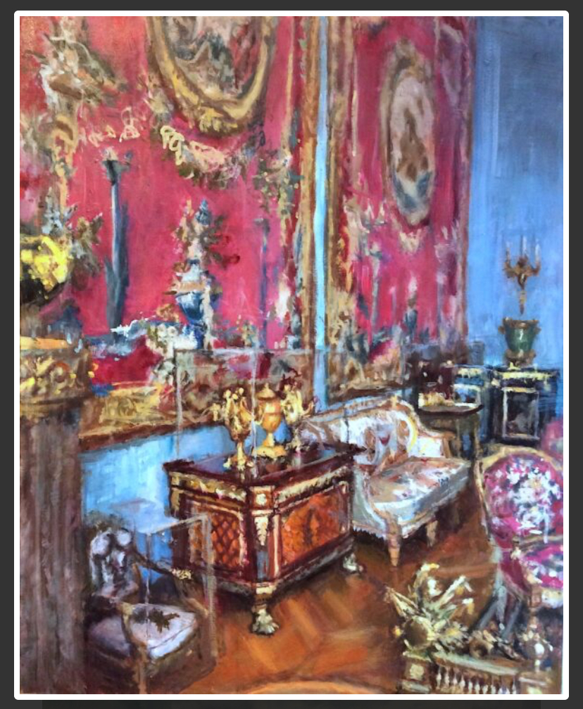
Val Nelson, The Gold Frequency, 2022, oil on canvas, 30x24inches.
Another amazing opulent room. She is able to capture everything with near perfect perspective. I like the richness of the wooded floor.
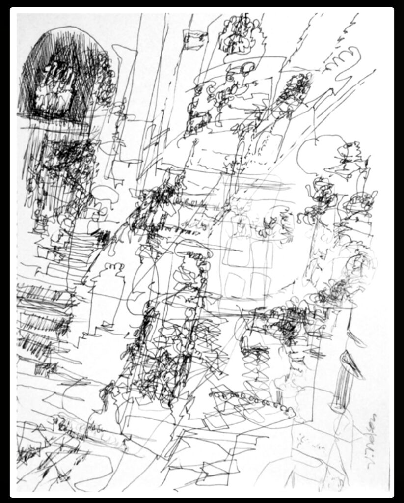
Val Nelson, Blind Logic 1, 2021. archival ballpoint pen, 11×8.5inches
This piece called to mind the one line drawings we did in unit one.